Brand Identity Design for Jewellery Brands UK: What It Takes to Look Premium
Jewellery is one of the most trust-dependent consumer categories. A customer buying a piece of jewellery, whether at £50 or £5000, is making a decision based almost entirely on how the brand makes them feel. They can't touch the piece before they buy it online. They can't assess the quality of the metal or the stone through a screen but what they can do is read the design.
This post is about what premium jewellery brand identity actually requires, and why so many jewellery brands underinvest in it at exactly the stage when it matters most.
Why jewellery brands need to think like luxury even at entry price points
The visual grammar of luxury is not about spending more. It's about restraint, consistency and the specific signals that communicate quality before the customer reads a word.
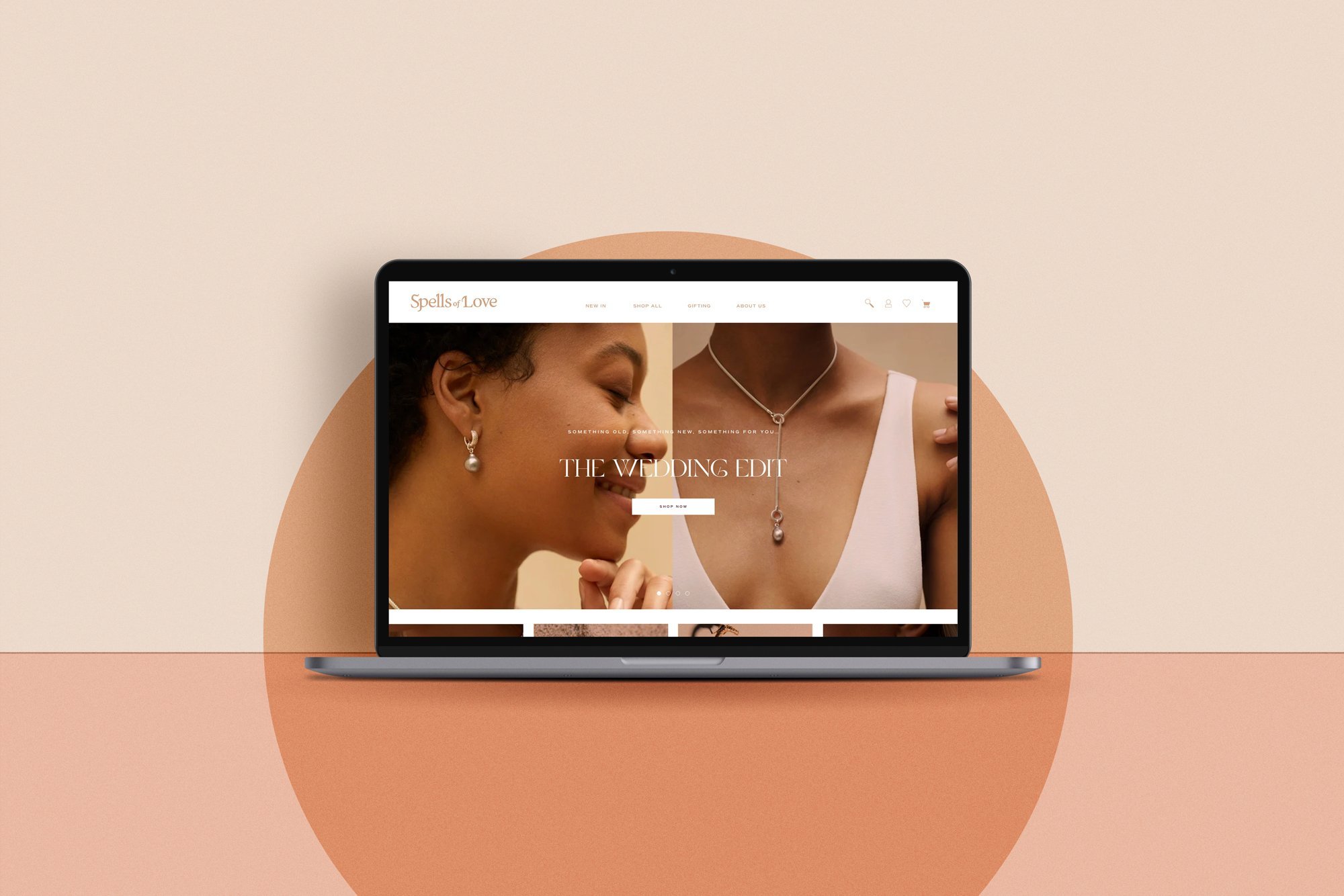
A jewellery brand charging £80 for a piece is competing visually against brands charging £800, because both appear in the same Instagram feeds, the same search results, the same gift guide roundups. If the £80 brand's visual identity communicates premium quality with the same consistency as the £800 brand, the conversion rate on the £80 piece will be significantly higher than a brand whose identity communicates entry-level.
The design of the brand sets the price expectation. Getting that expectation right is a commercial decision, not an aesthetic one.
The visual signals that communicate premium quality
There are specific design signals that premium jewellery brands use consistently, regardless of their actual price point.
White space and restraint.
The confidence to show one thing at a time with one piece, one photograph and minimal text. This communicates that the piece is worth looking at on its own. Overcrowded layouts suggest quantity over quality.
Typography quality.
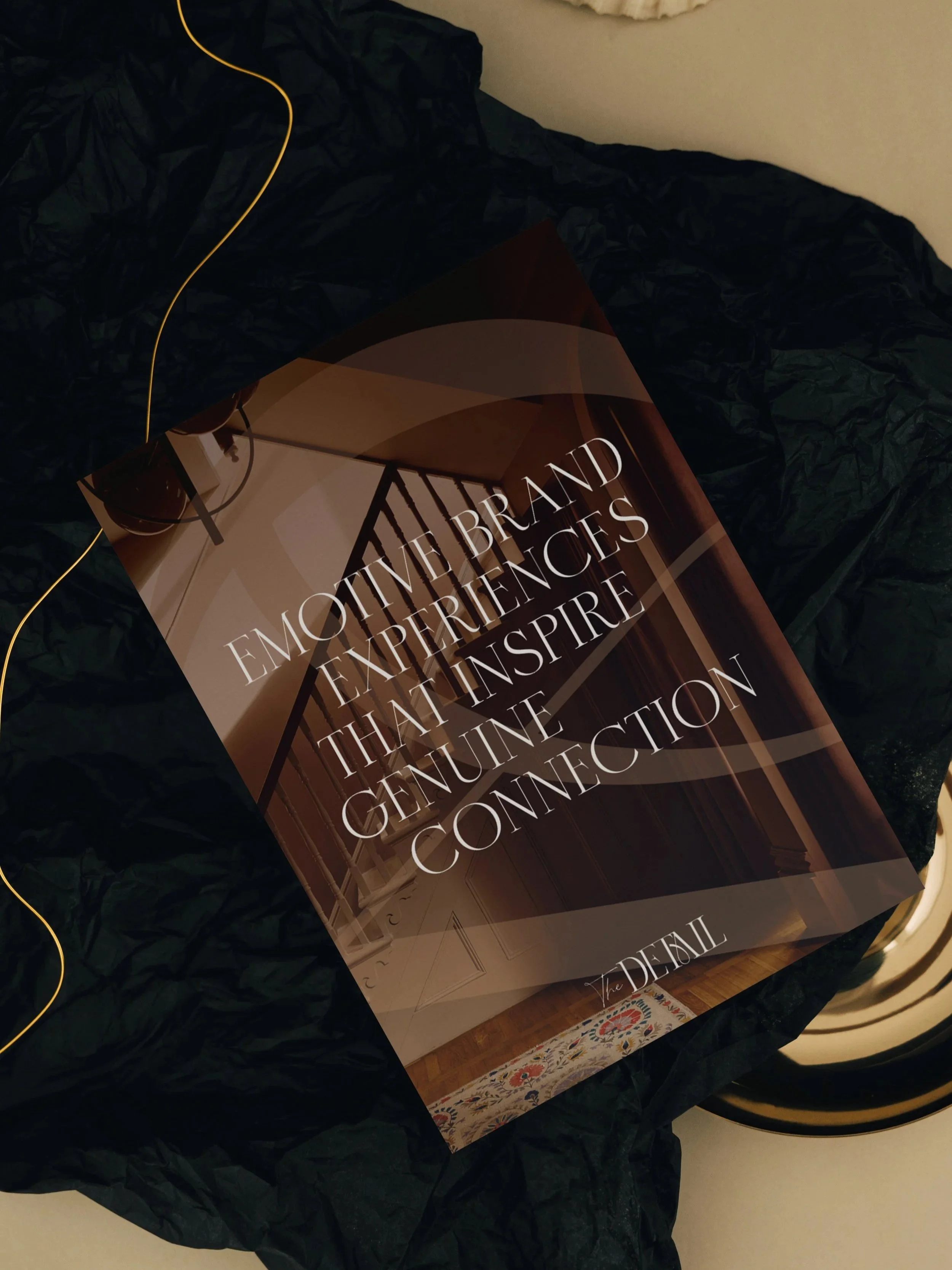
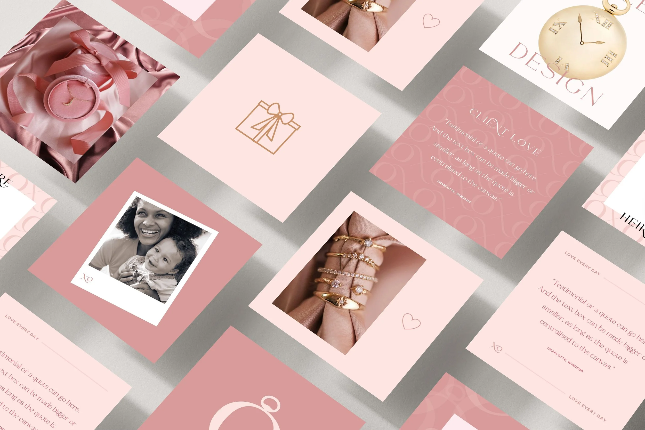
Typeface selection for a jewellery brand is a pricing signal. Thin serifs with generous letter-spacing communicate elevated quality. But consideration has to be made to feeling heritage when using traditional serifs - the wrong typeface can undermine the most beautiful product photography.
Colour palette discipline.
Premium jewellery brands use restrained palettes, typically two or three colours, used with clear rules about how and where they appear. A brand with an inconsistent or overly broad palette reads as less considered, regardless of the product quality. More colours can definitely be used – just used wisely.
Photography consistency.
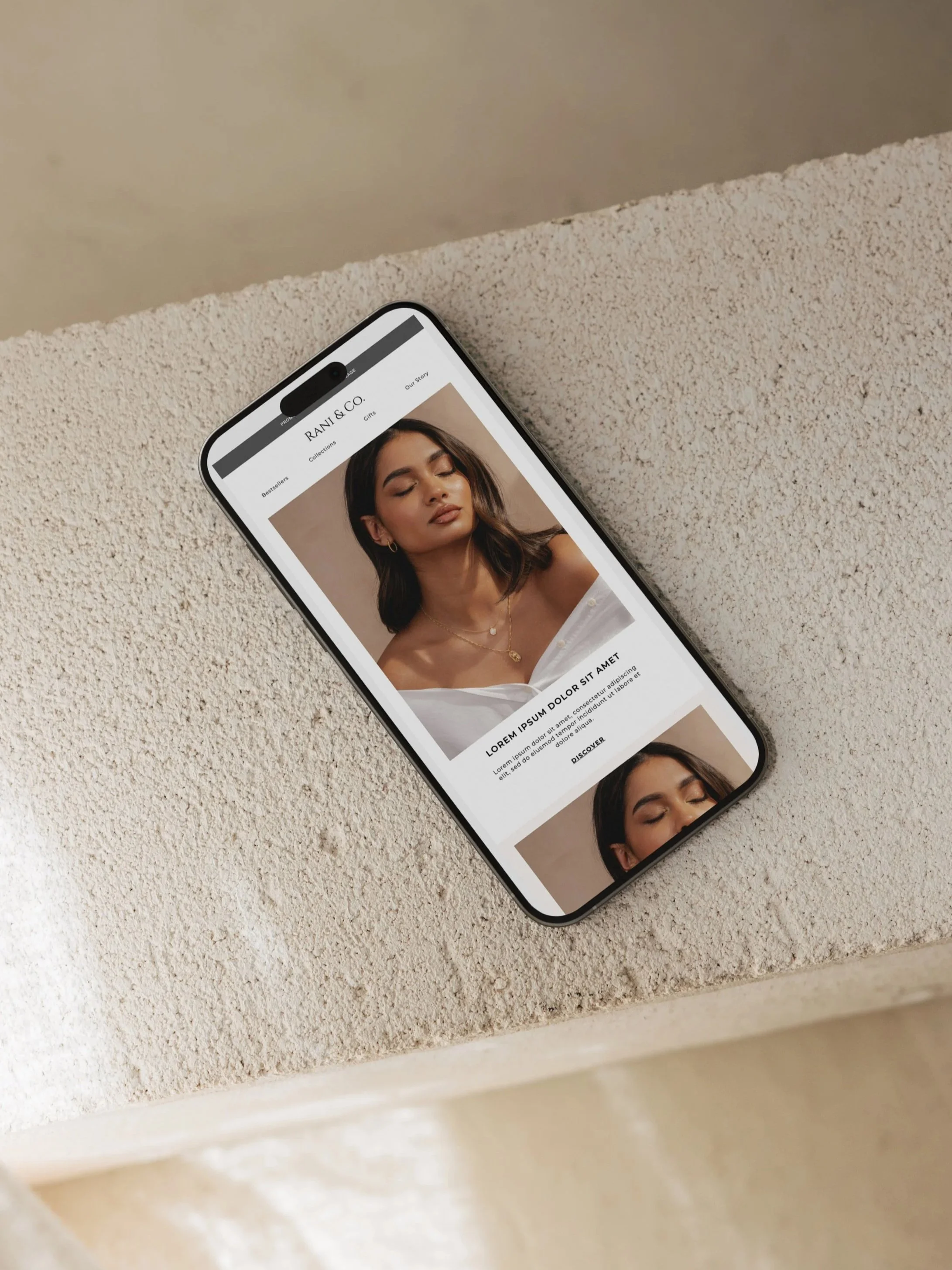
Inconsistent photography with some professional, some amateur and different backgrounds with different lighting, creates a trust gap that the product itself can't bridge. Consistent photography across every channel signals that the brand has standards it holds to.
Typography and the jewellery brand
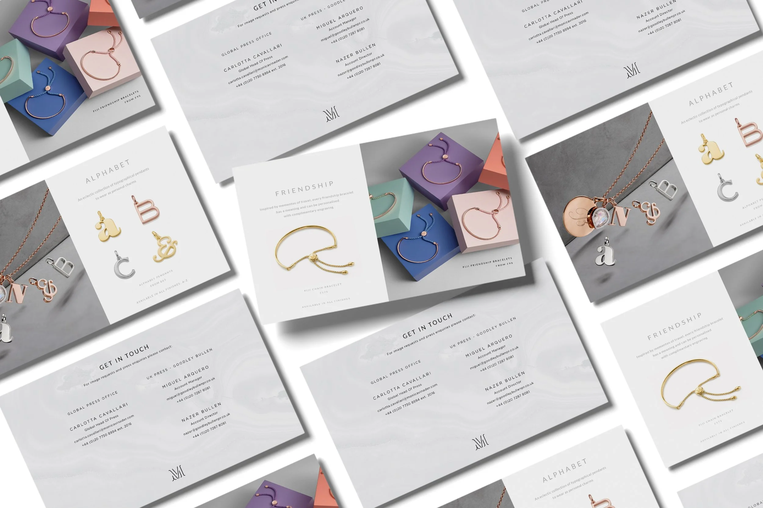
The typography of a jewellery brand is doing more work than most founders realise. Before a customer reads your product names, your about page or your pricing, they've already processed the quality signal your type is sending.
For premium jewellery, this usually means refined serifs or contemporary minimal sans-serifs with generous spacing. The hierarchy should be clear with the product name, the category, the price, the description, in that order of visual dominance. And the type should look the same across every touchpoint.
Photography and brand consistency
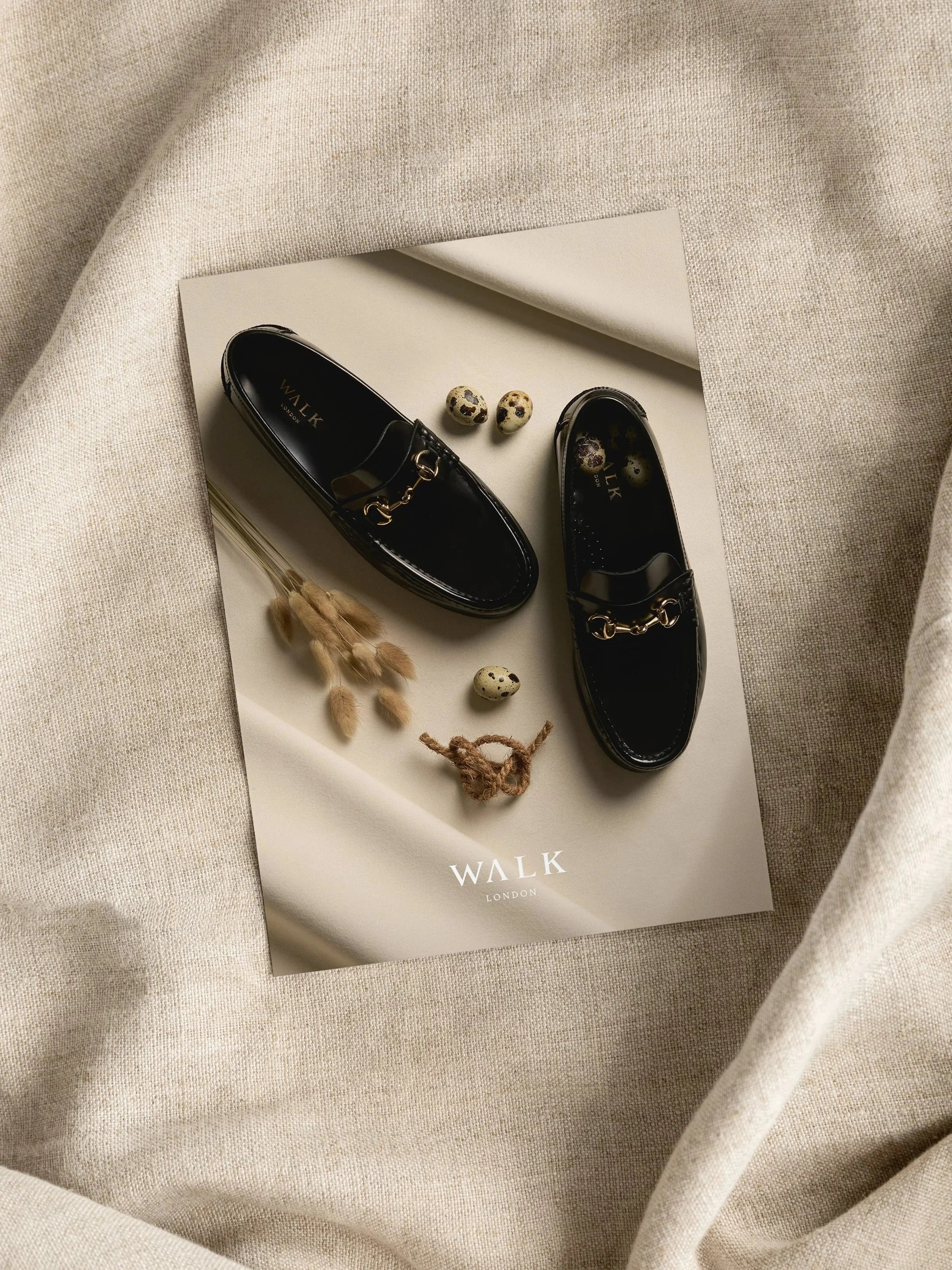
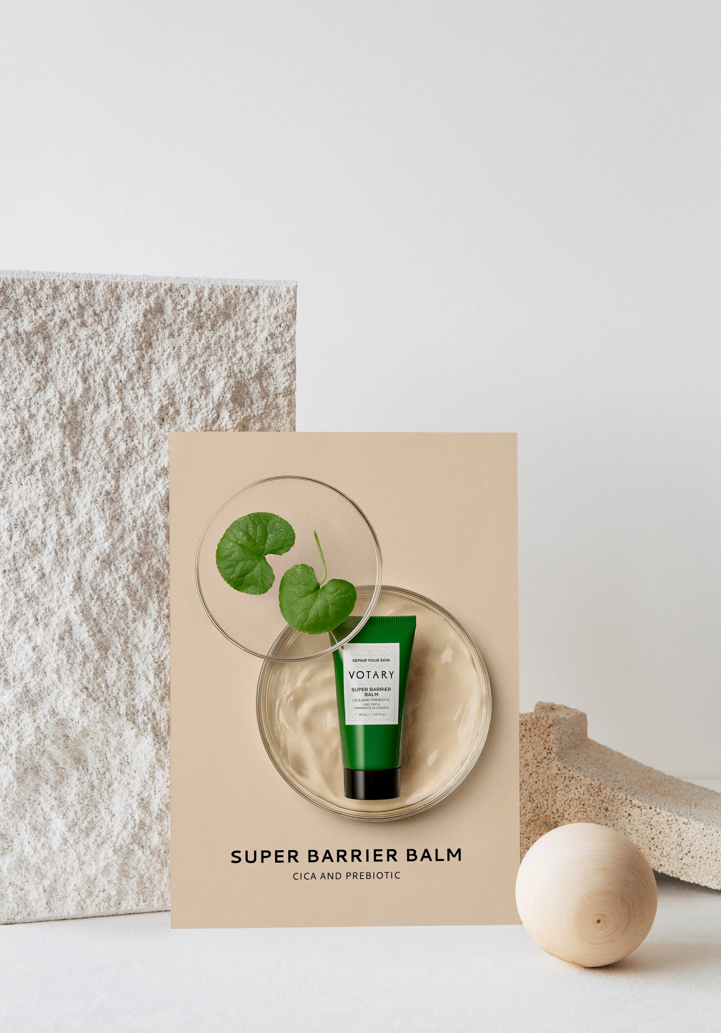
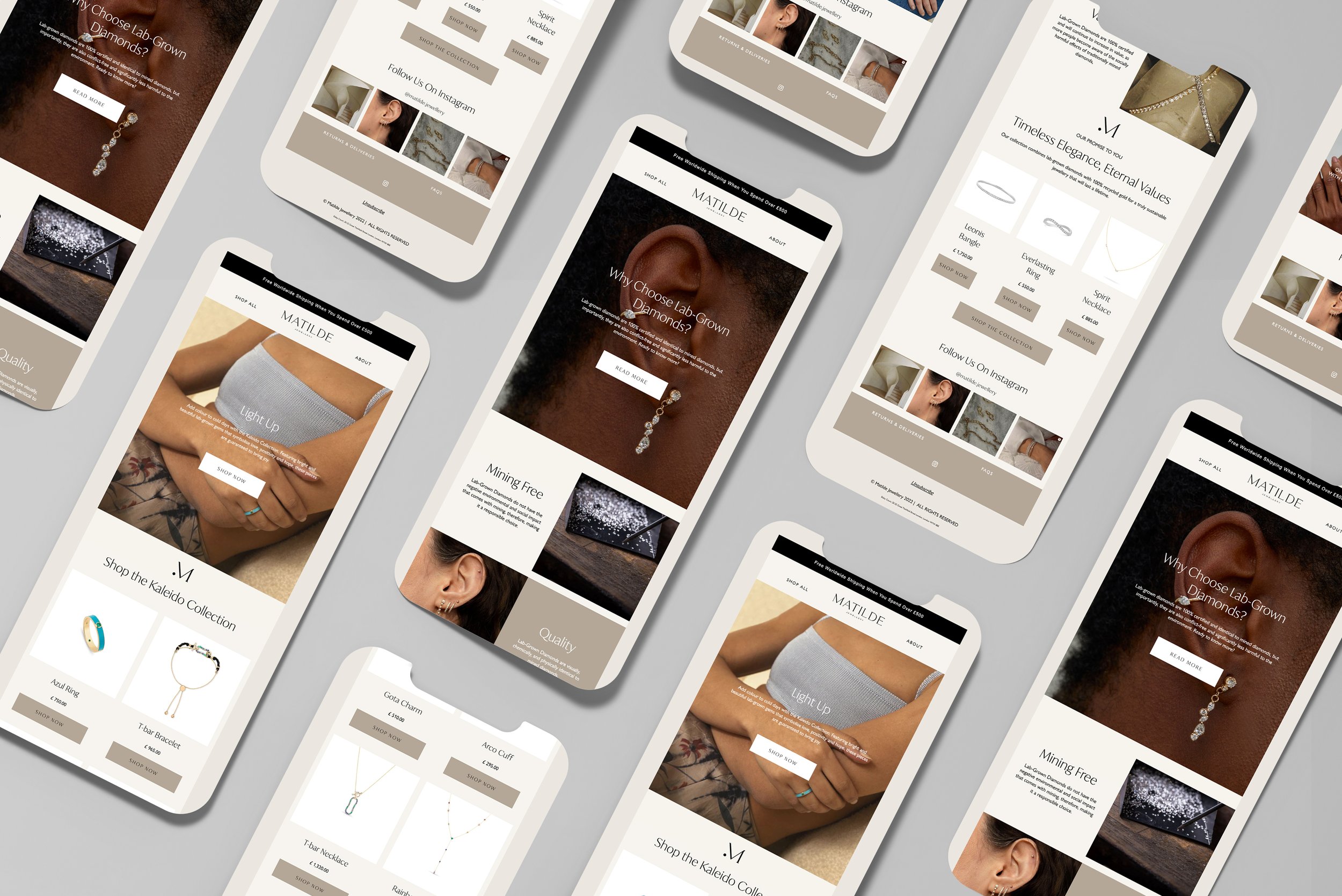
For jewellery brands, photography is the primary trust signal but the most common mistake isn't bad photography, it's inconsistent photography. A beautifully shot hero image surrounded by inconsistent secondary images creates doubt.
A coherent photography art direction meaning consistent lighting, consistent backgrounds, consistent styling approach, does more for brand trust than any single beautiful image.

What a strategic brand identity does that a logo alone can't
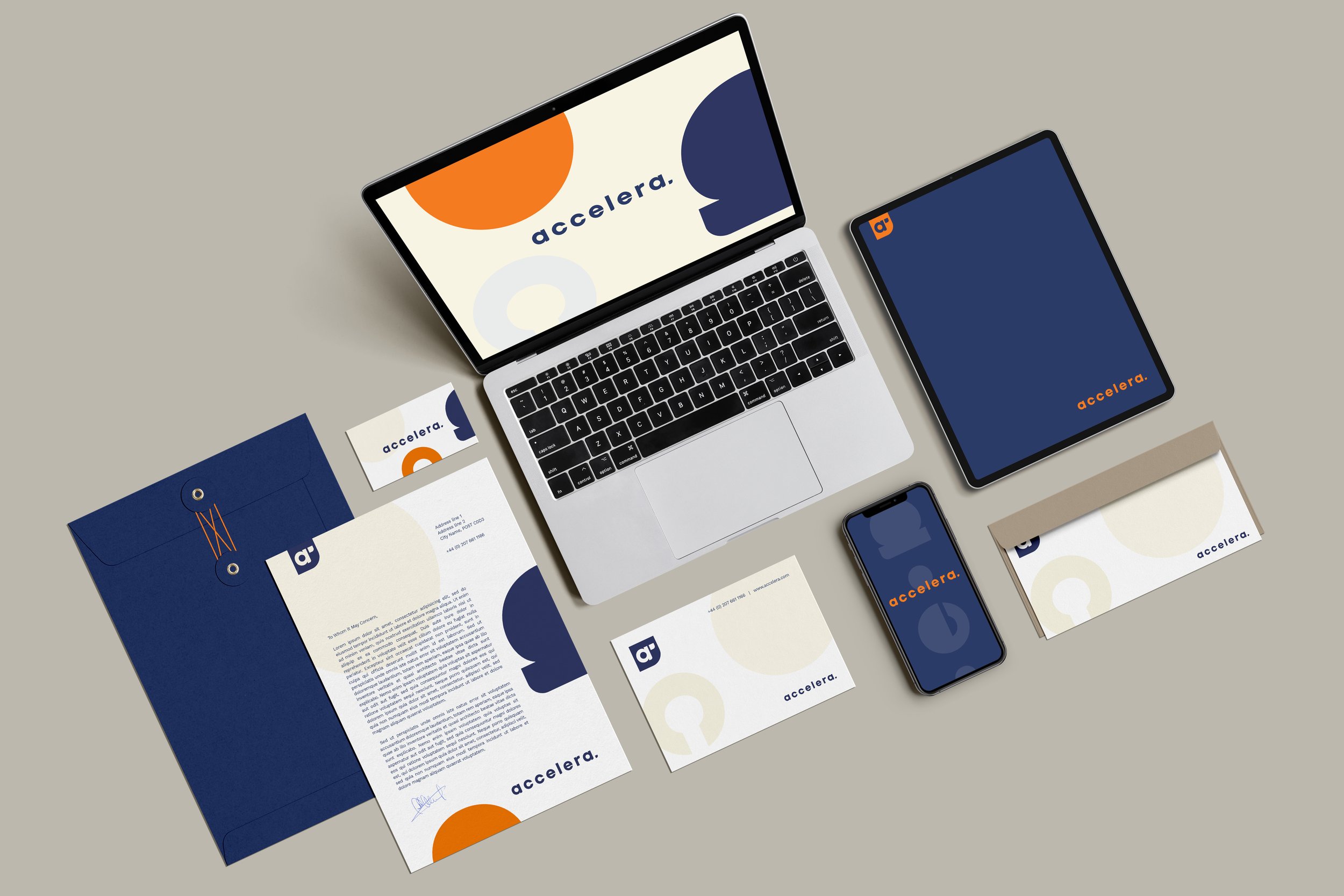
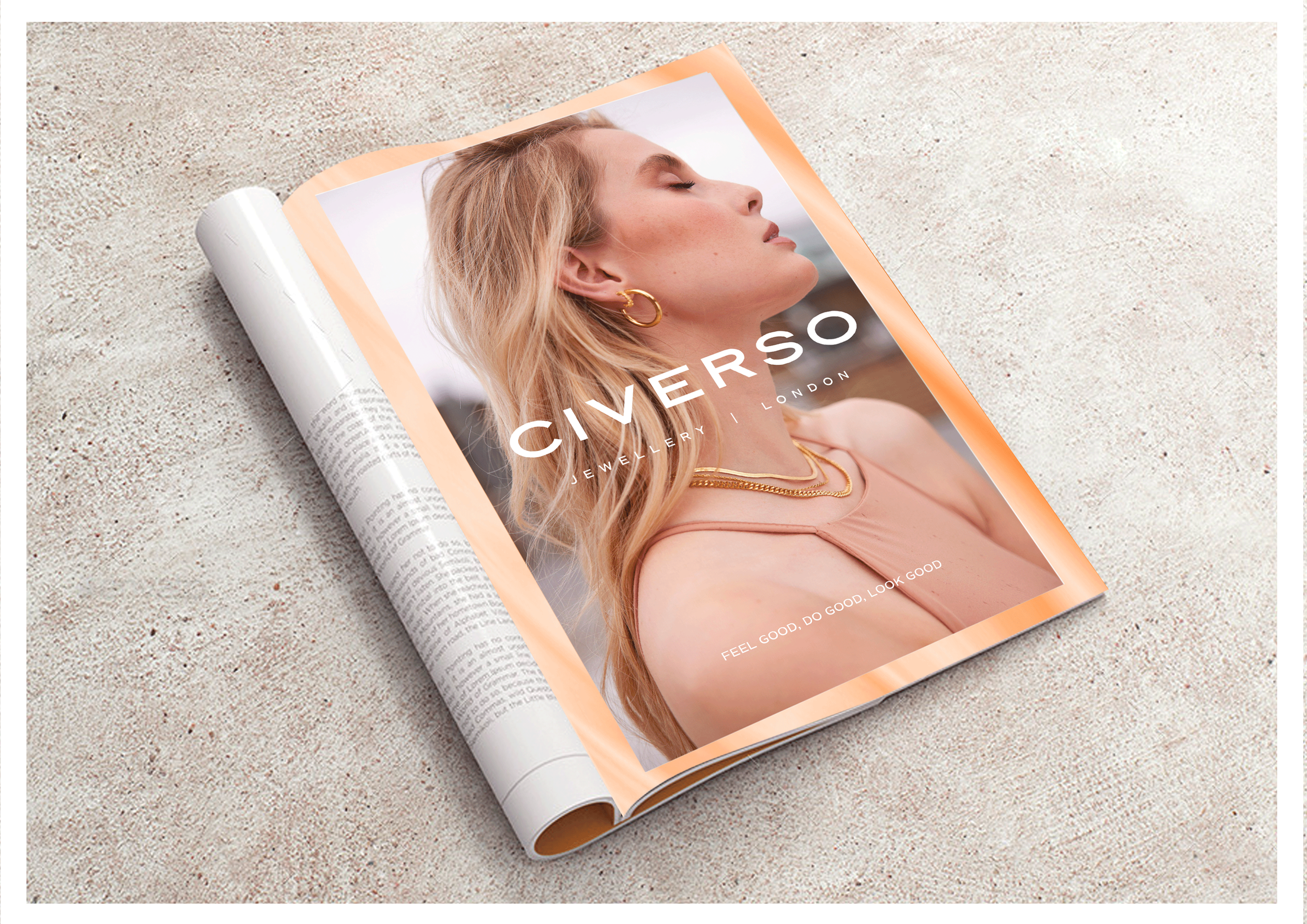
A logo is one element of a brand identity. A strategic brand identity is the full system - logo and logo variants, colour system, typography system, photography art direction, brand guidelines that govern how everything is used.
The system is what allows the brand to be consistent across Instagram, the website, packaging, email, printed materials and any new surface it appears on as the brand grows. Without the system, consistency requires someone who knows the brand implicitly to be involved in every decision. With it, consistency is built into the process.
For jewellery brands planning to grow by expanding the range, moving into wholesale, building a wholesale catalogue, launching new collections, having a brand system is the infrastructure that makes growth possible without visual coherence degrading.
Working with a branding studio on jewellery identity
The right studio will ask about the commercial context before they start designing. What price point is the brand at? Who is the customer? What does the brand need to communicate to hold that price point and build trust with that customer? What does success look like commercially in the next two years?
The answers to those questions should inform every creative decision in the project.
Find out about Brand Atelier, our strategic brand identity service for scaling consumer brands, here.