The Hidden Revenue Leak in Growing Retail Brands
When revenue slows or conversion softens, the instinctive reaction for many growing retail brands is to increase marketing activity. More paid ads. More email campaigns. More social content. More traffic.
The assumption is simple. If more people arrive, more people will buy.
But in practice, volume does not compensate for friction.
We regularly work with fashion and lifestyle brands whose products are strong, whose traffic is healthy and whose ambition is clear, yet performance feels heavier than it should. Conversion rates sit below expectation. Pricing conversations feel tense. Marketing spend increases without proportional return.
The issue is rarely effort. It is structure.
Got a project in mind and want to get in touch?
Structural design misalignment is one of the most common hidden revenue leaks in ecommerce.
This misalignment shows up in subtle but commercially significant ways.
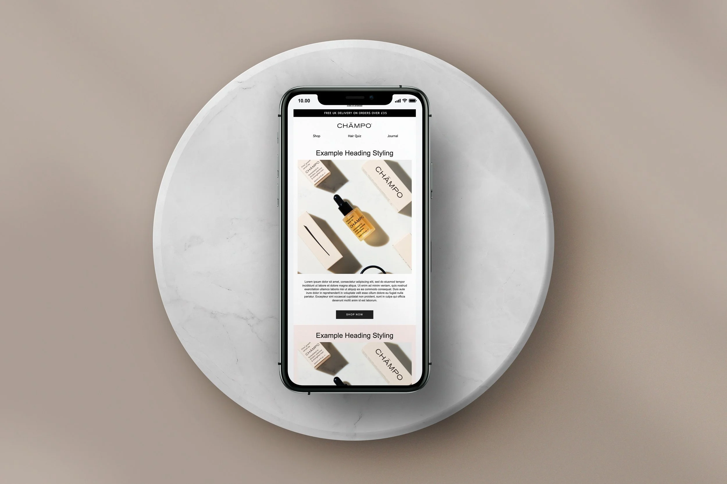
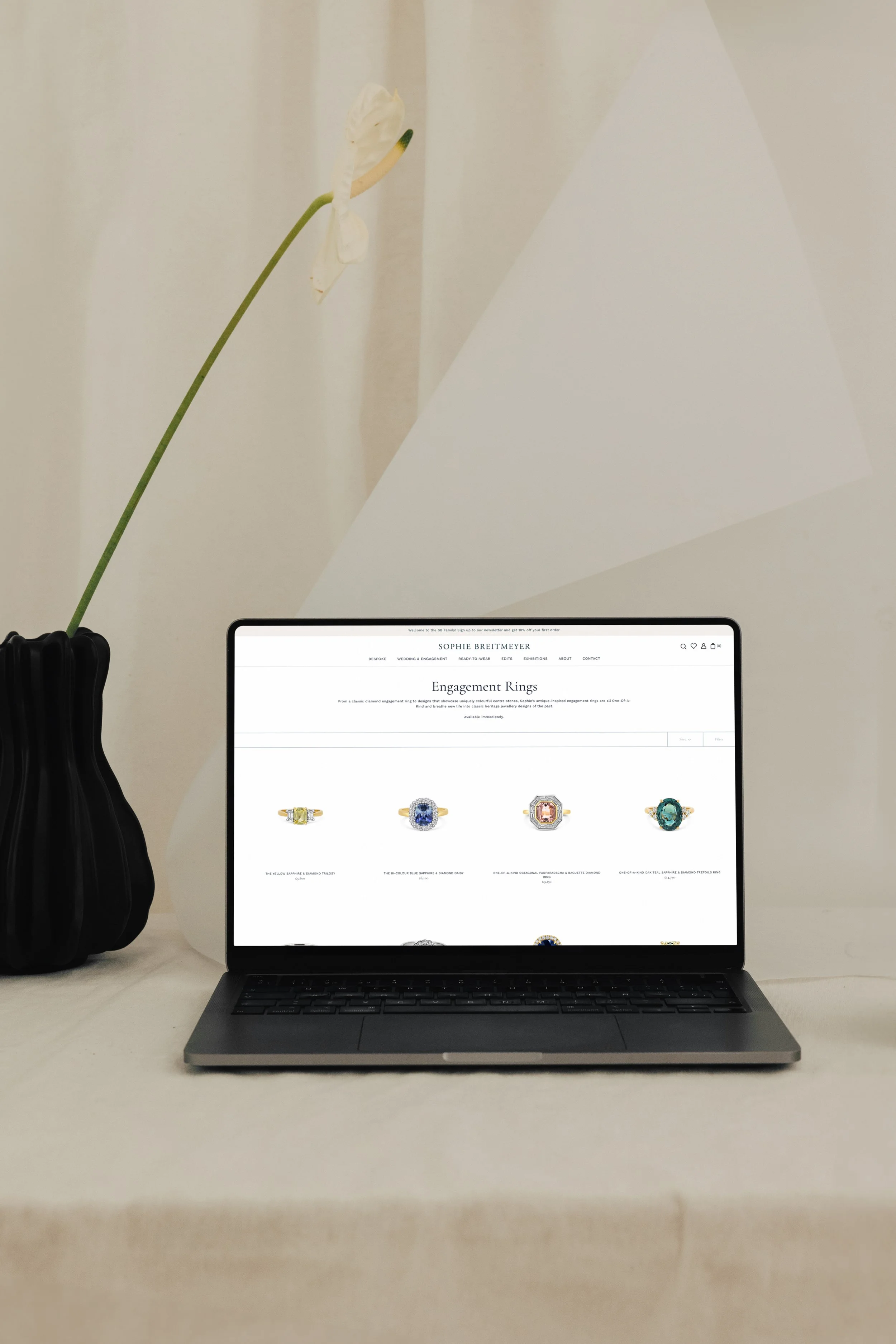
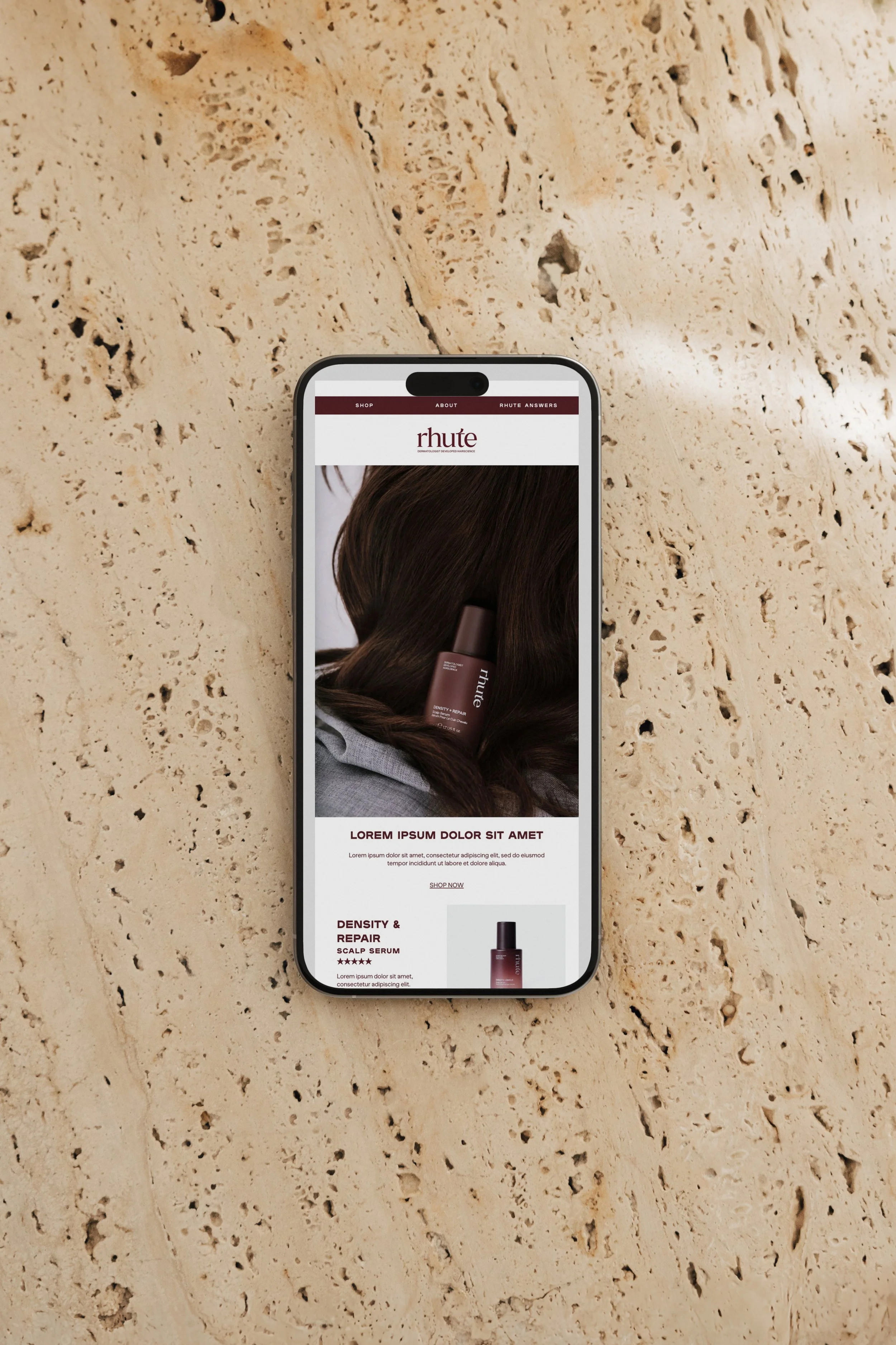
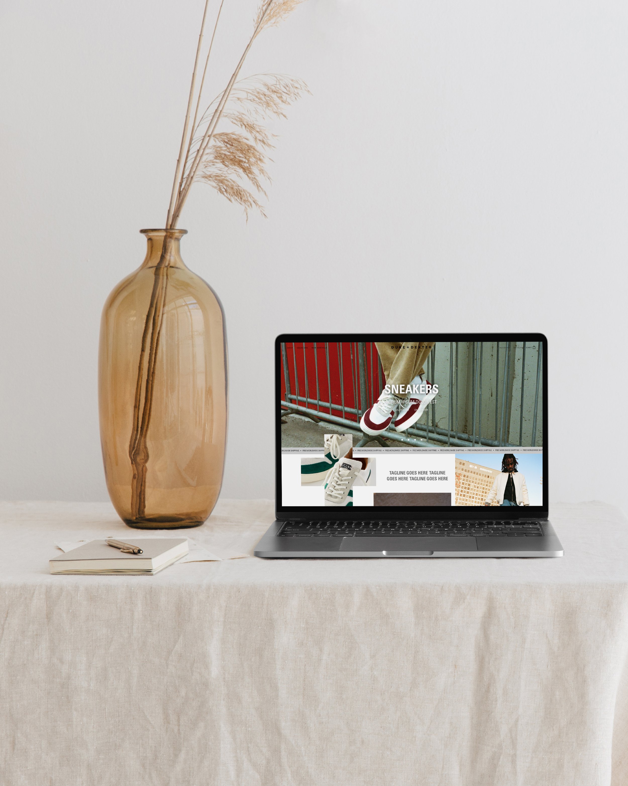
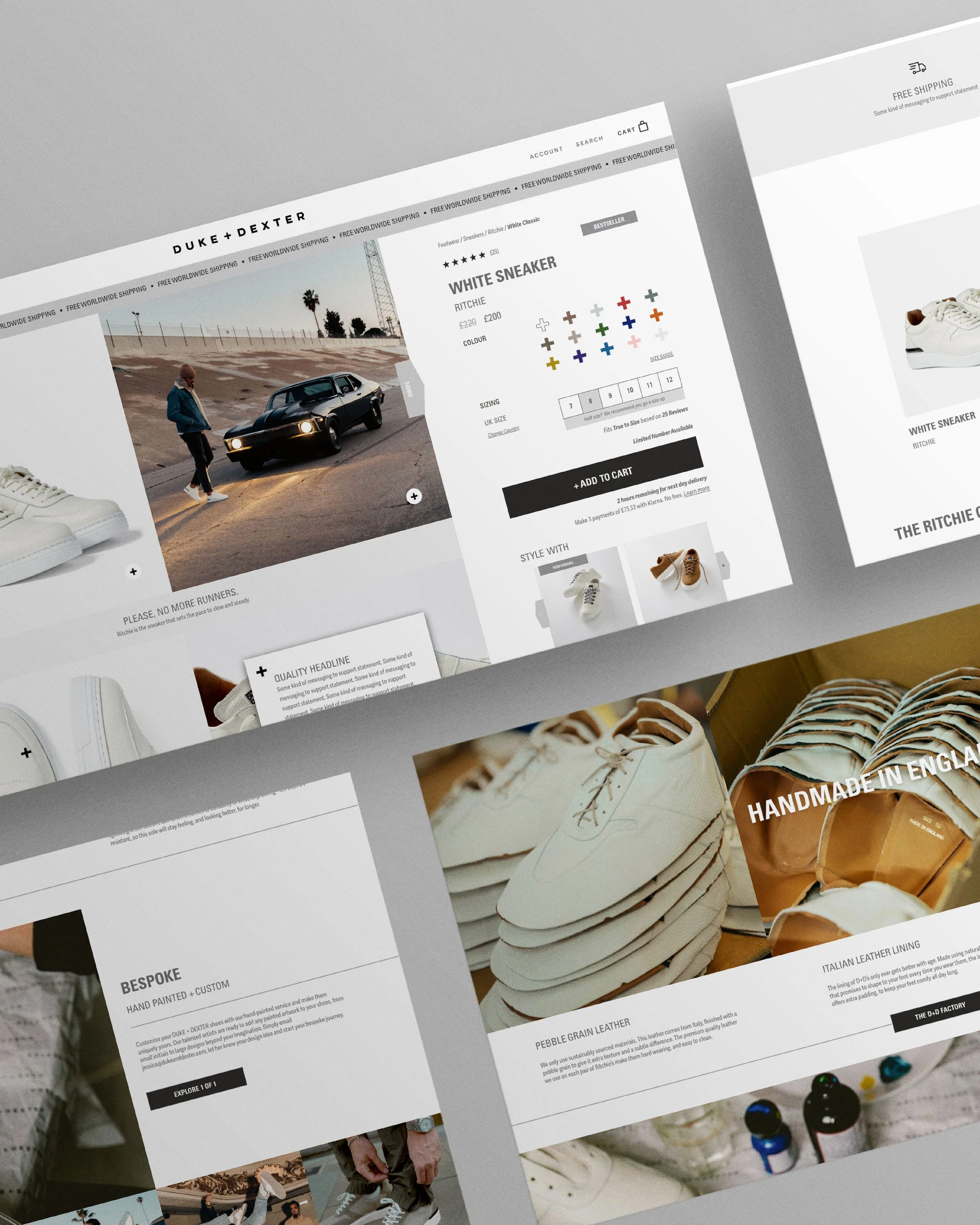
Typography lacks hierarchy, making product information harder to scan.
Product pages describe materials and features but fail to communicate aspiration or emotional value.
Visual language shifts between social media, email campaigns and website experience, weakening perceived consistency.
User journeys prioritise aesthetics over clarity, increasing cognitive load at key decision points.
Don Norman’s work on cognitive load and user centred design explains why this matters. When people encounter friction or uncertainty, even at a micro level, they disengage. In ecommerce, hesitation has a direct commercial consequence. The customer pauses. They compare. They postpone. Sometimes they leave entirely.
In sectors like fashion and luxury retail, perceived value is inseparable from presentation. Rory Sutherland frequently argues that perception shapes economic value more than we like to admit. If your brand and website design do not reinforce quality, customers subconsciously discount you before they consciously decide to.
This is where commercially focused graphic design and creative consultancy differ from purely aesthetic design. The goal is not to make something look attractive in isolation. The goal is to build a cohesive brand system and ecommerce experience that reduces cognitive effort, increases clarity and strengthens emotional resonance.
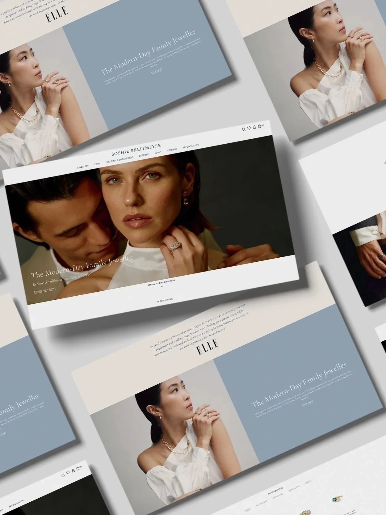
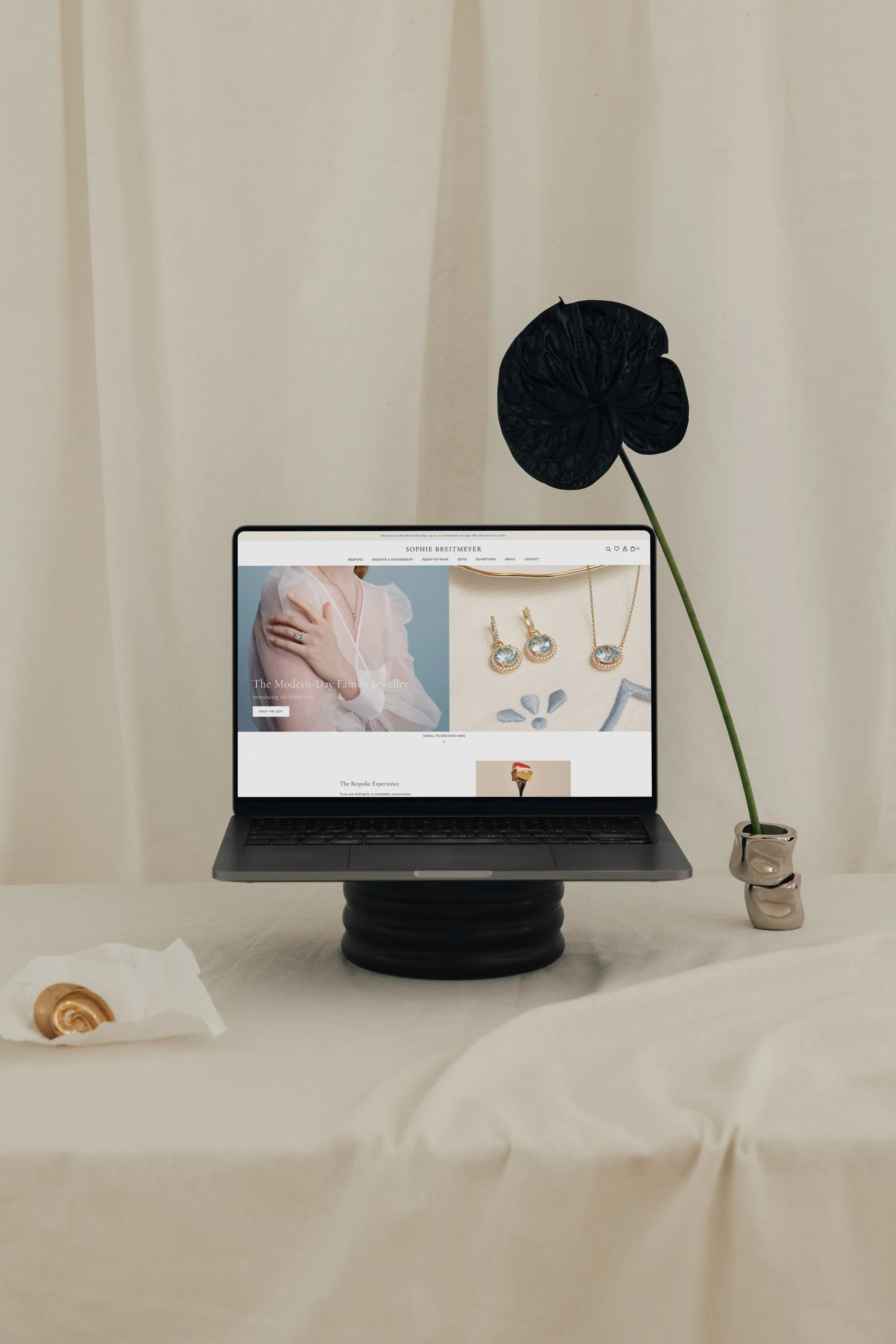
Strong typography hierarchy guides the eye. Clear product storytelling builds desire rather than simply listing specifications. Consistent visual language across website, social media and email builds trust through repetition. Thoughtful UX design removes unnecessary decisions and gently directs behaviour.
When these elements align, marketing works harder because friction has been removed at the foundation.
Before increasing advertising spend, it is worth asking a different question.
Is your brand and website design commercially structured to support the level of growth you are aiming for?
If traffic is healthy but performance feels strained, the hidden leak may not be visibility. It may be design.
For founders investing seriously in growth this year, refining your brand identity, ecommerce website design and overall visual system is not cosmetic. It is commercial.
If you would like to explore how strategically structured design can support your next phase of growth, you can learn more about our approach here.
We also share further insights, recommended reading and frameworks for scaling brands with our subscribers each month. You can join via our homepage.