
PRESENTATION & REPORT DESIGN SERVICES
Presentation & Report Design for Brands, Teams & Stakeholders
A great presentation doesn’t just share information.
It shapes perception.
Whether you’re pitching investors, presenting to stakeholders, sharing internal strategy or publishing a customer-facing report, design influences how clearly your message is understood and how credible your business feels.
The problem is that most presentations are built under pressure.
Slides become cluttered. Important information gets buried. Complex ideas become harder to follow. Even strong businesses can appear less credible simply because the document communicating their message feels rushed or inconsistent.
At Soley Creative, we design presentations and reports that balance clarity, credibility and visual impact — helping important information land with more confidence.
WHY THIS EXISTS
In high-stakes communication, clarity matters.
The strongest presentations aren’t necessarily the most visually elaborate. They’re the ones that reduce cognitive load, guide attention and make complex information easier to absorb.
That might mean simplifying data visualisation, restructuring page pacing or refining hierarchy so the most important information is immediately clear.
Done well, presentation design becomes a commercial tool.
It improves confidence, strengthens credibility and helps people engage more meaningfully with your message.
Good design doesn’t just make documents look better, it makes them easier to understand
What do you need help with?
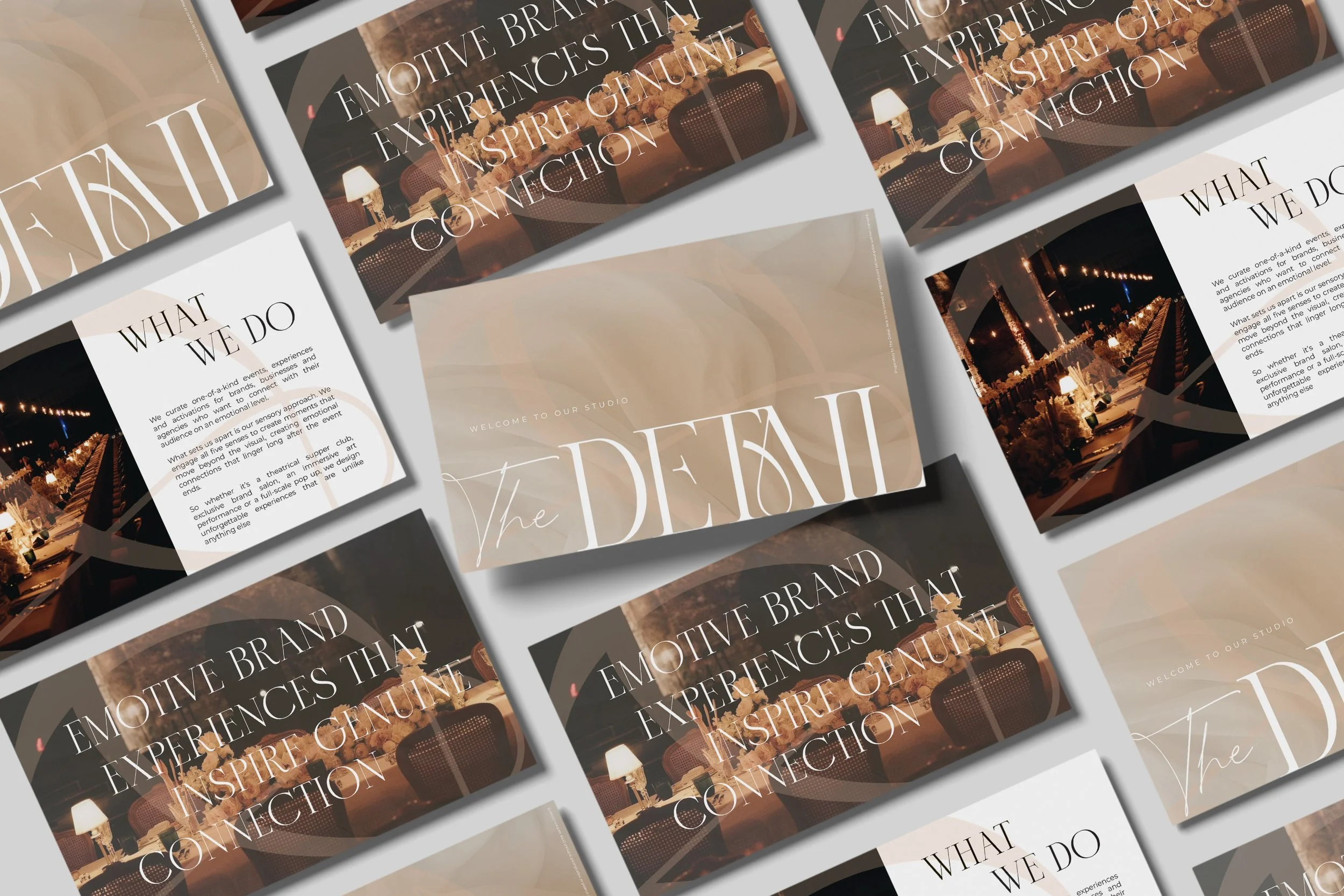
Presentation Template Design
You need a reusable master template your team can use repeatedly.
Best for:
internal teams
recurring sales decks
proposal templates
board presentations
investor updates
Presentation & Report Design
You need a one-off, high-impact document for a specific purpose.
Best for:
investor decks
fundraising presentations
pitch decks
sustainability reports
annual reports
ESG reports
gender pay gap reports
Presentation Template Design
Most businesses don’t realise how much time is lost to formatting.
Every new presentation starts with the same decisions.
Which font size works best? How should charts look? How should sections be structured? Where should imagery sit?
Repeated across teams, those small decisions become a major drain on time and consistency.
Presentation Template Design creates a branded slide system that gives your team a flexible framework for future presentations.
What you’ll walk away with:
Master slide template
Reusable page layouts
Chart and data styling
Typography hierarchy
Brand asset integration
Editable master file
Presentation Template Design begins at:
£1,250 + VAT
Typical investment:
£1,250–£3,500+
Presentation &
Report Design
Some documents carry more weight than others.
A fundraising presentation may influence investment decisions.
A sustainability report may shape stakeholder trust.
A pitch deck may determine whether an opportunity moves forward.
These aren’t documents you want to leave to rushed formatting or generic templates.
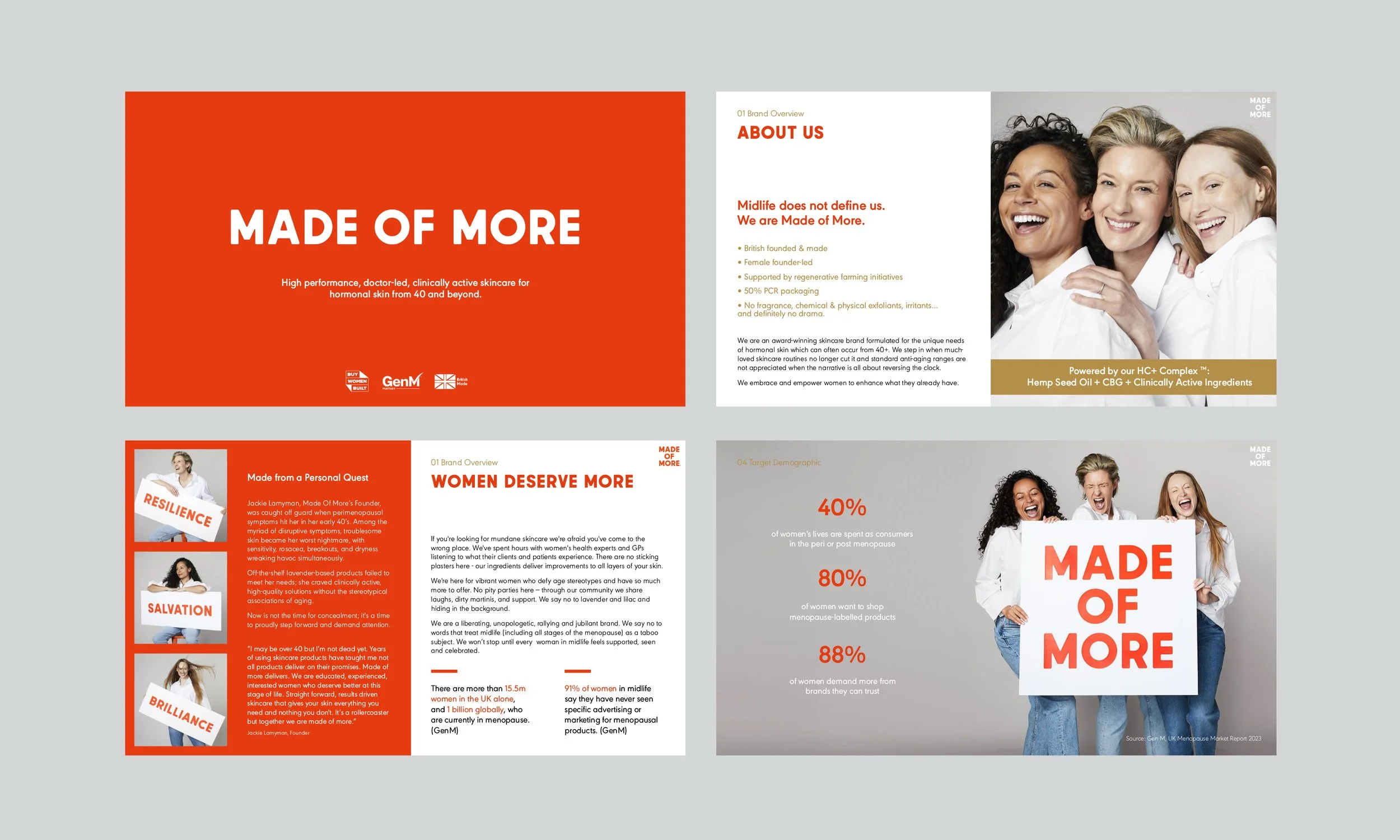
Presentation & Report Design is a bespoke service focused on transforming supplied content into clear, credible and professionally designed communications.
We refine layout, pacing, hierarchy and visual storytelling so complex information becomes easier to understand and more persuasive.
What you’ll walk away with:
Professionally designed deck or report
Improved page hierarchy
Better information flow
Data visualisation
Charts and diagrams
Final export in preferred format
Projects begins at:
£950 + VAT
Typical investment:
£2,000–£8,000+
Large reports may exceed this depending on complexity.



Clients we’ve supported
We’ve designed presentations and reports for brands including:
From luxury consumer brands to investor-facing businesses, our focus remains the same: making important information easier to understand and more impactful to present.

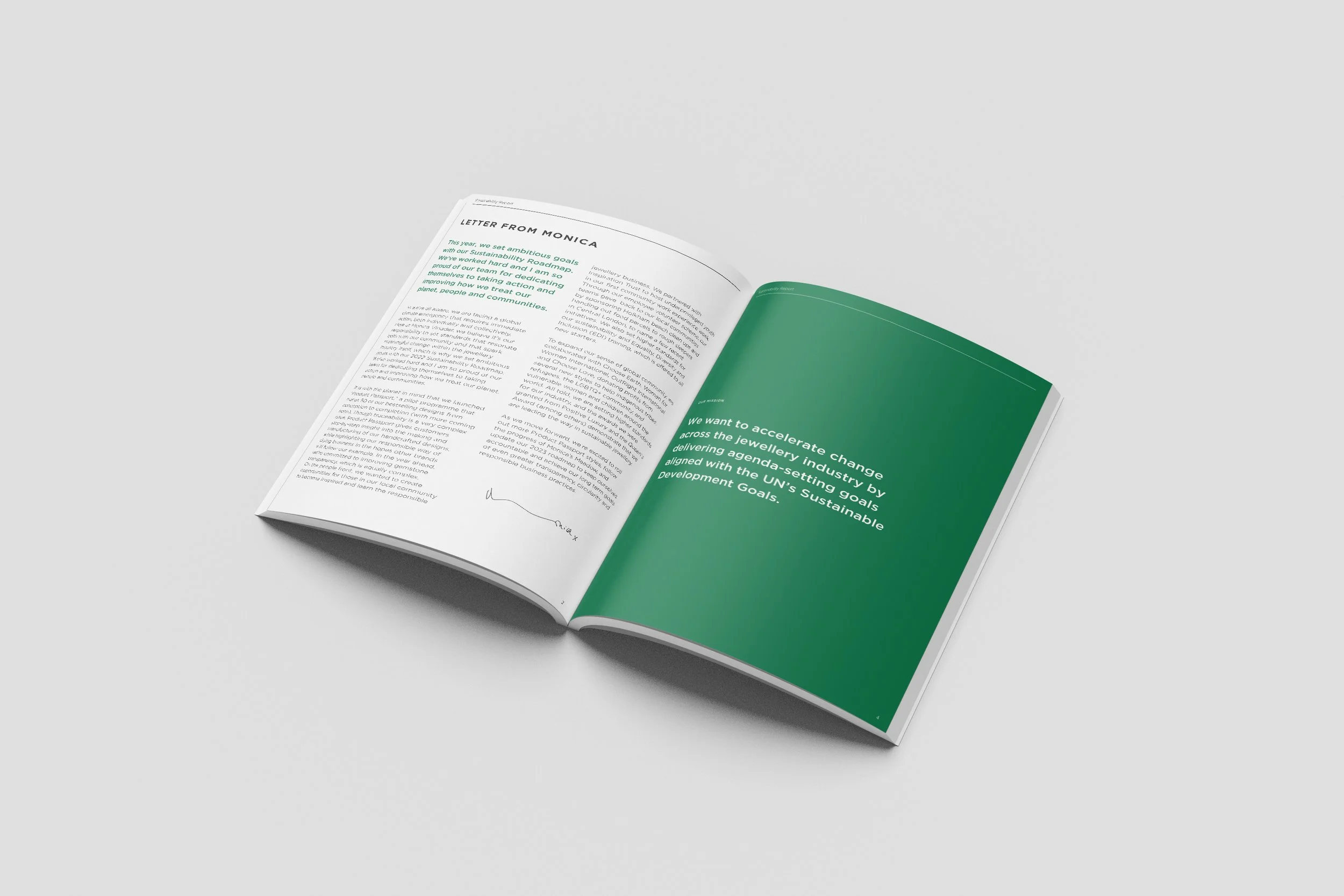
CASE STUDY
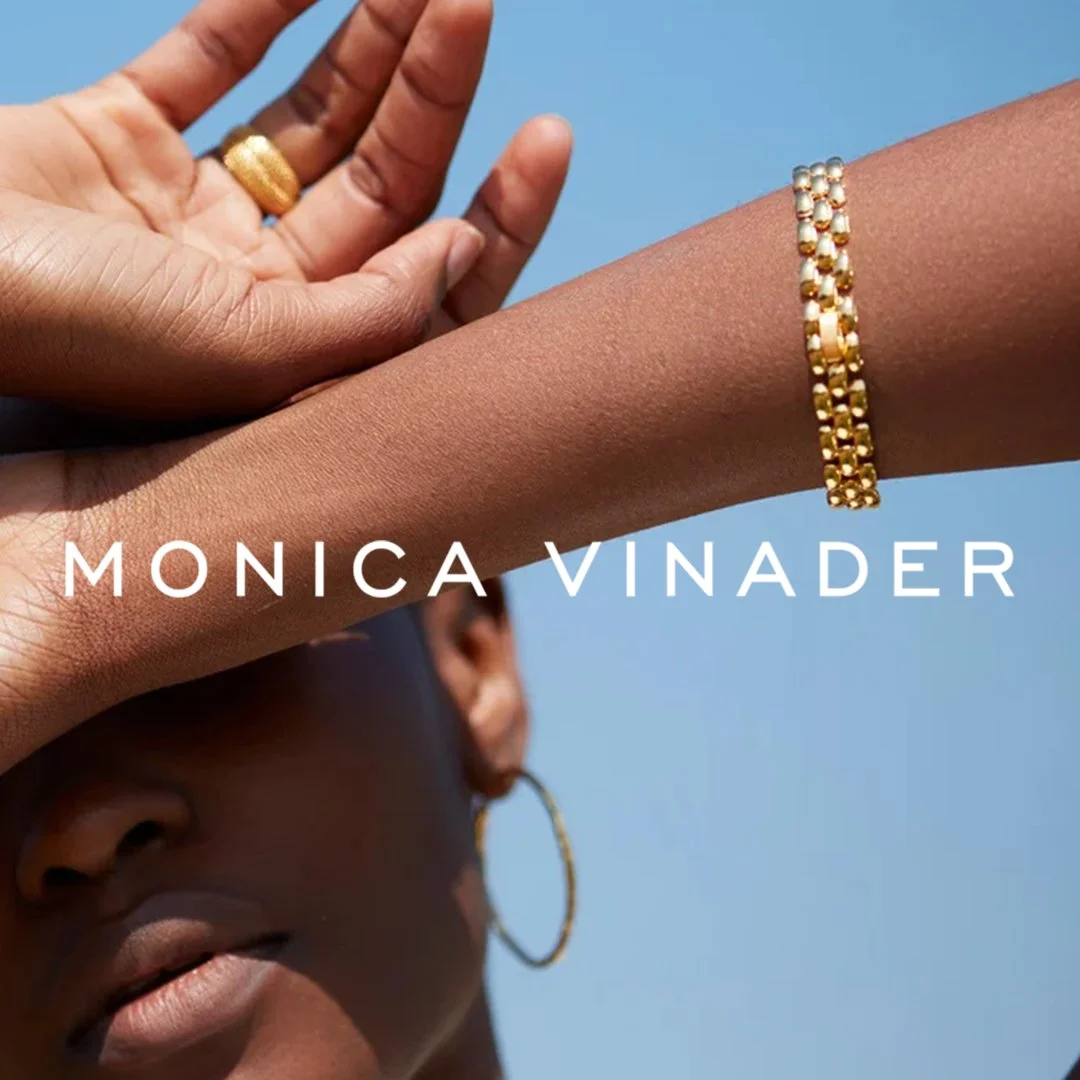
Monica Vinader
Designing a premium sustainability report for stakeholder trust and brand credibility
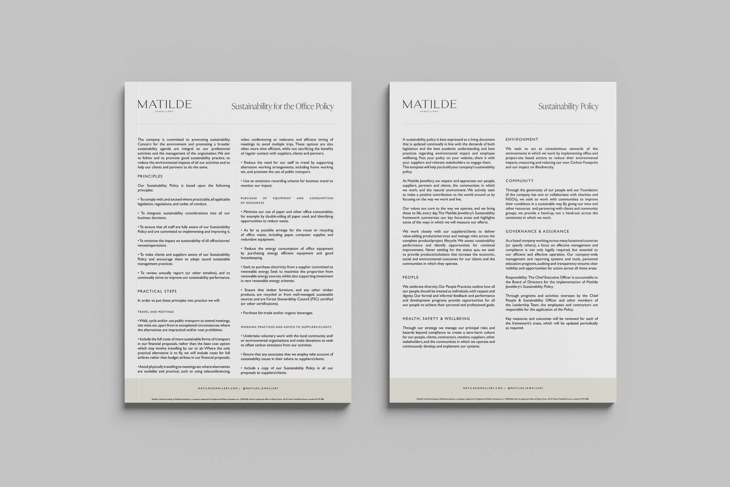
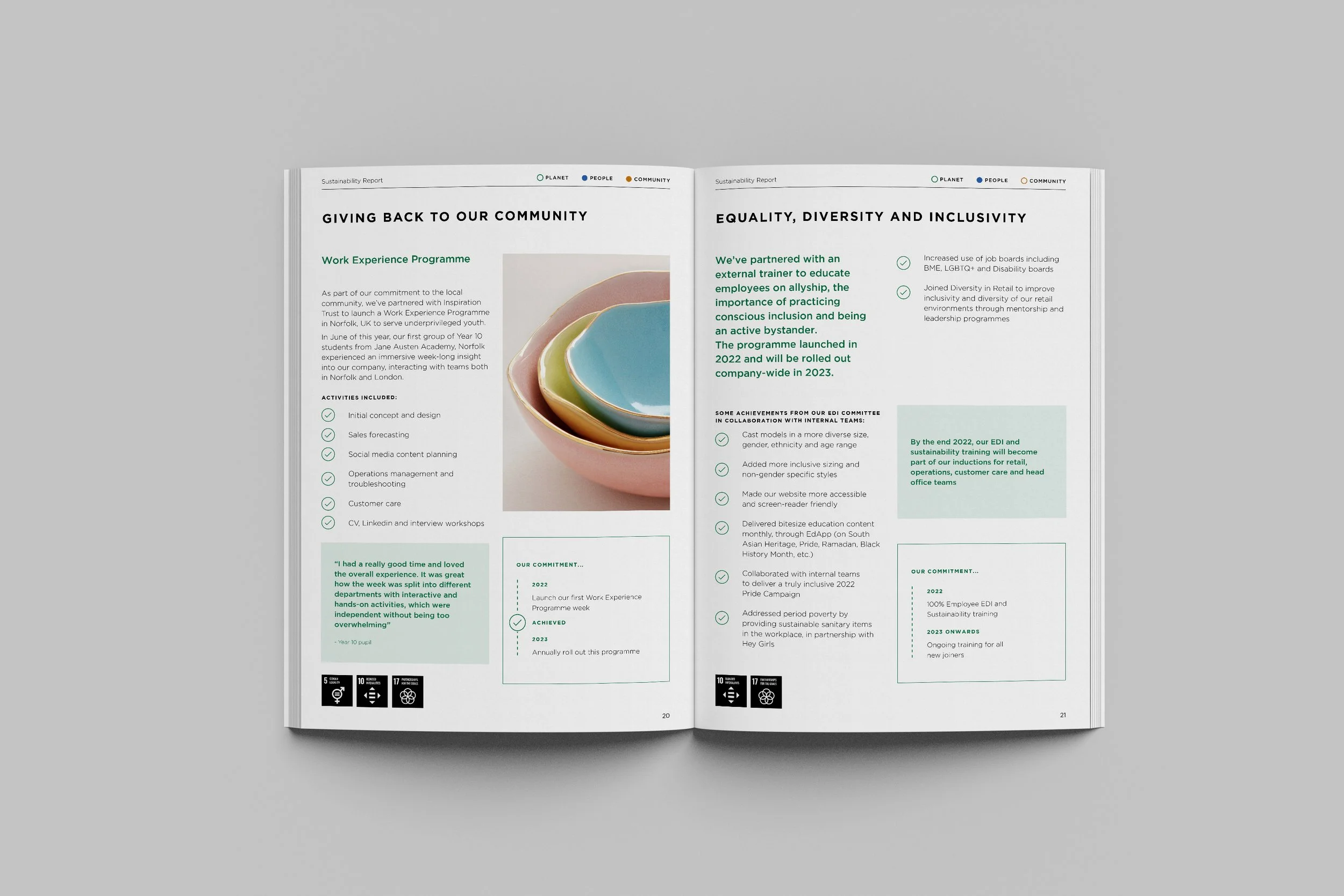
We worked on the design of a sustainability report for luxury jewellery brand Monica Vinader, helping translate detailed ESG and sustainability information into a more engaging and accessible document.
The challenge was balancing depth of information with clarity. Sustainability reports often contain dense policy, technical commitments and performance data, which can easily feel overwhelming or difficult to digest.
The goal was to create a report that felt both informative and aligned with Monica Vinader’s premium brand positioning, ensuring stakeholders could engage with the content more meaningfully.
Scope included:
Report design and layout
Information hierarchy refinement
Data visualisation
Page pacing and readability optimisation
Premium brand alignment
Commercial impact:
The final report strengthened how sustainability commitments were communicated externally, helping build trust and reinforce brand credibility with customers, partners and stakeholders.

CASE STUDY
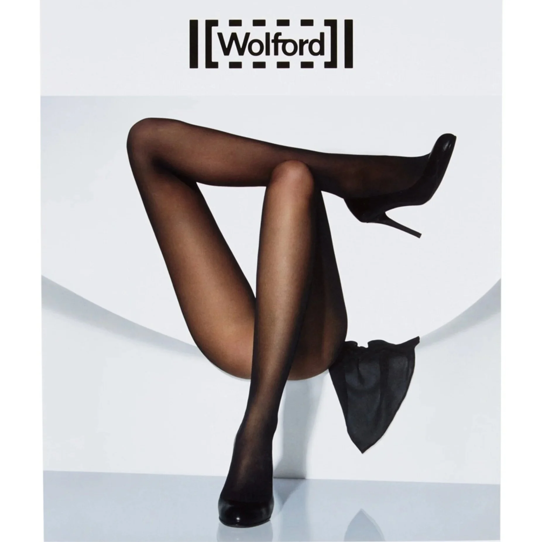
Wolford
Building internal brand documentation to improve consistency and alignment.
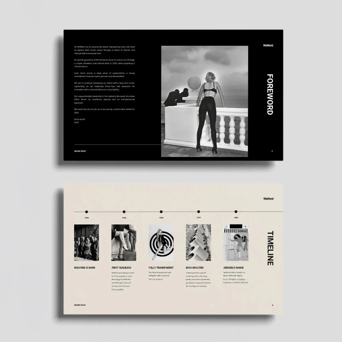
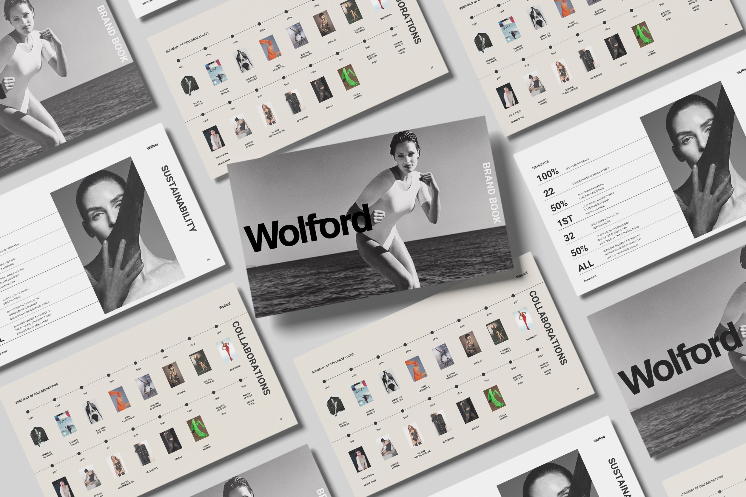
We supported global fashion brand Wolford with the design of internal brand documents and a brand book used to support clearer alignment across teams.
The challenge here wasn’t external communication but internal consistency.
As brands scale, ensuring teams, partners and suppliers all work from the same understanding of the brand becomes increasingly important. Without clear documentation, decision-making slows and brand consistency weakens.
Our role was to transform internal documentation into structured, usable resources that teams could reference more easily in day-to-day decision-making.
Scope included:
Brand book design
Internal documentation layout
Information hierarchy
Brand asset structuring
Visual consistency across documents
Commercial impact:
Clearer internal documentation helped reduce ambiguity, improve team alignment and strengthen brand consistency across future creative and commercial decisions.

Key Takeaways
The value of presentation and document design goes far beyond aesthetics.
Externally, it shapes trust and perception.
Internally, it improves clarity, consistency and decision-making.
In both cases, better design helps information work harder.
Frequently Asked Questions
Still have questions? Take a look at the FAQ or reach out anytime. If you’re feeling ready, go ahead and apply.
-
No. Clients typically provide structured content, and we focus on design, hierarchy and visual communication.
-
We commonly deliver in:
PowerPoint
Google Slides
Canva
Adobe InDesign
Illustrator
PDF
-
Yes. While we don’t provide strategic consulting or copywriting, we frequently advise on page structure, content pacing and hierarchy.
-
Yes — data visualisation and diagram design can be included where required.
Important information deserves better design
Whether you need a reusable presentation system or a high-impact one-off document, we help ensure your message feels clear, credible and professionally communicated.