How to Make Your Brand Feel Premium - The Design Signals That Matter
There is a persistent myth in consumer branding that looking premium costs more. The gap between an £80 candle and a £12 candle is mostly a function of margin and marketing budget. It isn't. It's a function of design signals. Those specific, learnable, repeatable decisions that communicate quality before a customer reads a single word or checks a price tag. This post breaks down five of those signals and explains why they work commercially, not just aesthetically:
Got a project in mind and want to get in touch?

1. White Space and Restraint
Premium brands use space deliberately. Where entry-level brands fill every centimetre with product claims, imagery, calls to action, they feel scattered and unclear. That’s premium customers leave room. Restraint communicates confidence; it says, we don't need to convince you of everything at once. We trust that one good thing, given space, speaks louder than five things competing for attention.
In practice
Review your homepage, your packaging, and your social grid. Ask whether every element is there because it earns its place, or because someone felt the silence needed filling. The silence is doing work.
2. Typography as a Price Signal
Typeface selection is one of the most underestimated commercial decisions in branding. Customers read typography before they read words. A thin serif with generous tracking communicates elevated quality. A heavy rounded sans-serif communicates approachability. Neither is wrong but they speak to different buyers and different price points.
If your brand is positioned as premium but your typography says accessible, you are creating a mismatch that customers feel even if they cannot articulate it. The fix is rarely a typeface change alone but more of an understanding what your typography is communicating and whether that matches what your brand needs to charge.
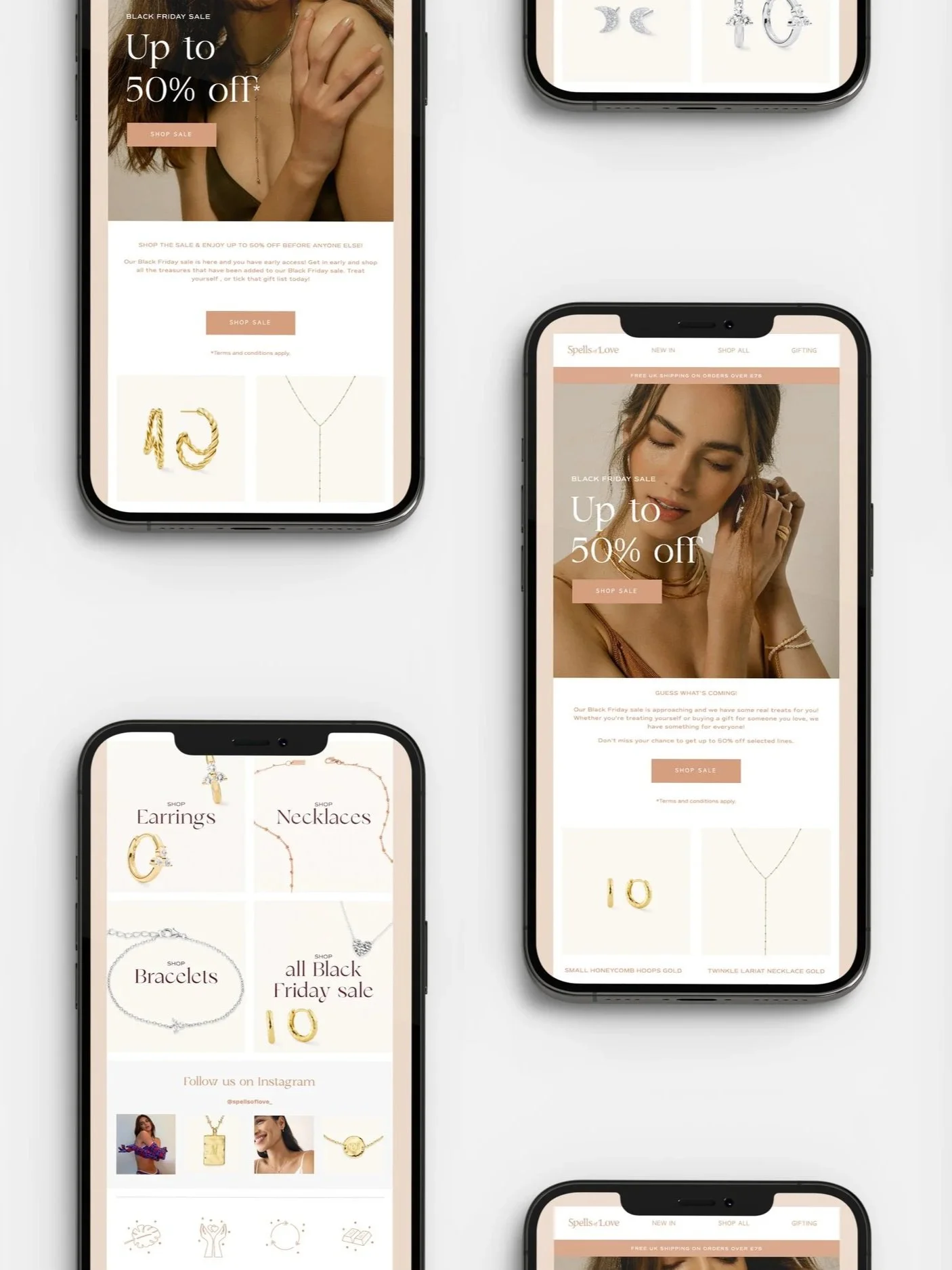
3. Colour Restraint
Premium palettes are limited to two or three colours, used consistently and with intention. They feel considered because they are. When a brand uses five or six colours constantly even beautiful ones, it begins to feel busy, and busy feels affordable.
Note: your colour palette might have more colours in than two or three, but there should be a hierarchy of use that stipulates the core palette which is normally the more limited version.
The colour restraint principle extends to how colours are combined. Premium brands rarely put their full palette on a single page. The other colours appear selectively to create hierarchy and emphasis. This is a system discipline, not just an aesthetic preference.

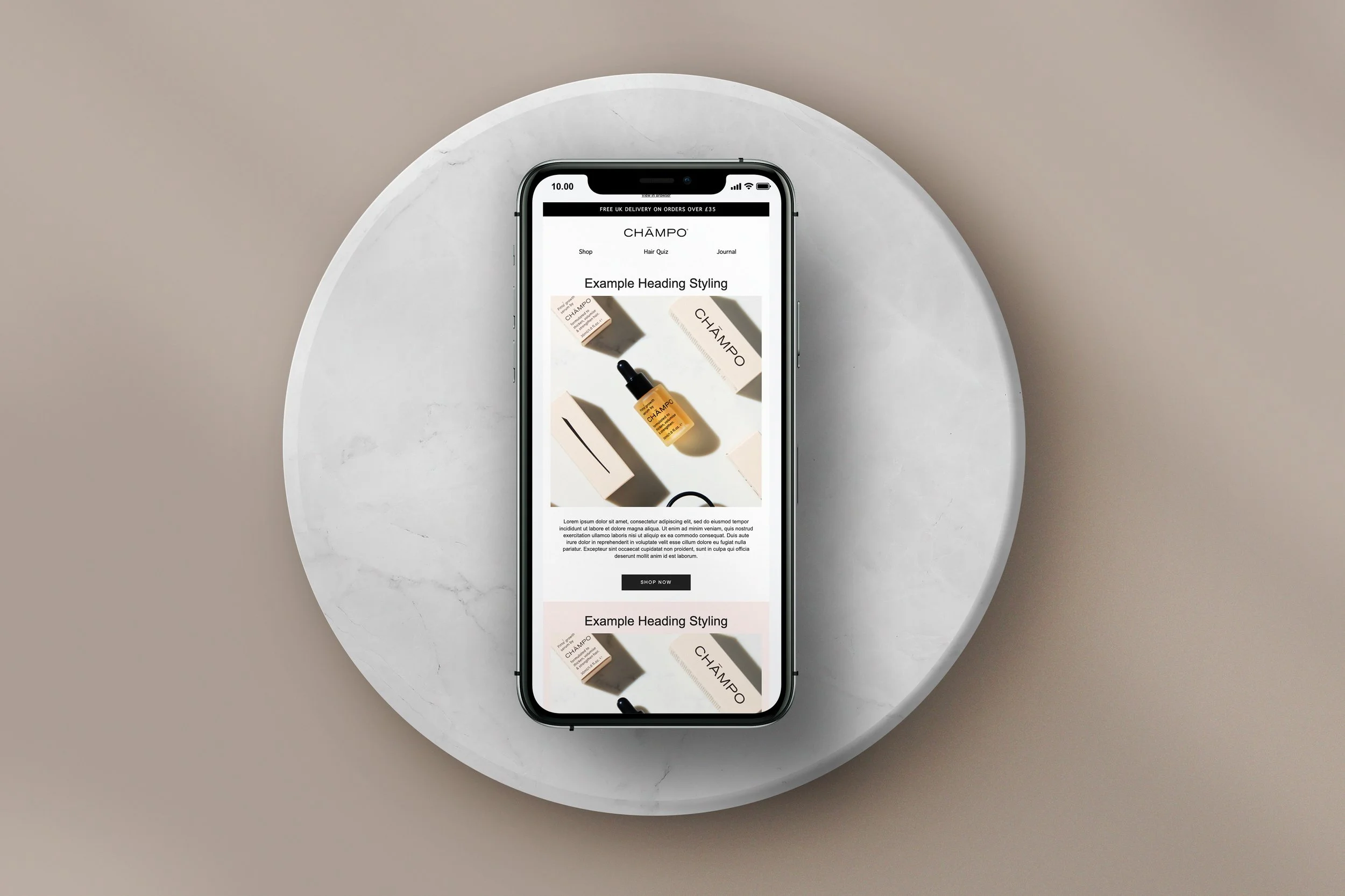
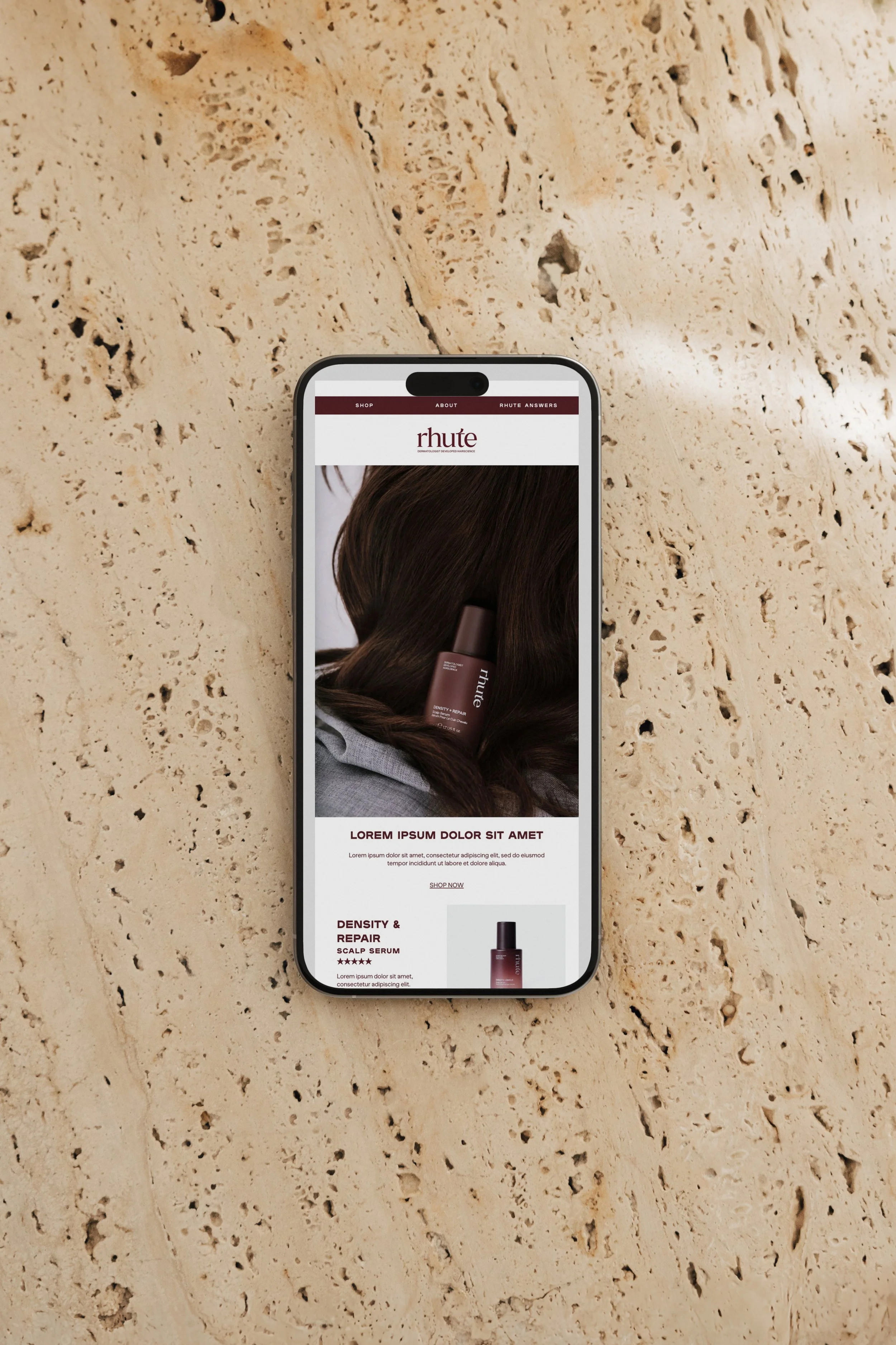
4. Photography and Visual Grammar
The visual grammar of premium photography is specific: macro shots, negative space, shallow depth of field, a single subject given the whole frame. These choices say one thing clearly: this product is worth looking at on its own. We don't need to surround it with context to justify the price.
If your brand photography is strong but your overall visual identity is inconsistent, the photography is doing all the work and the brand is undermining it. Premium is not one great image. It's what happens in the spaces between the great images.
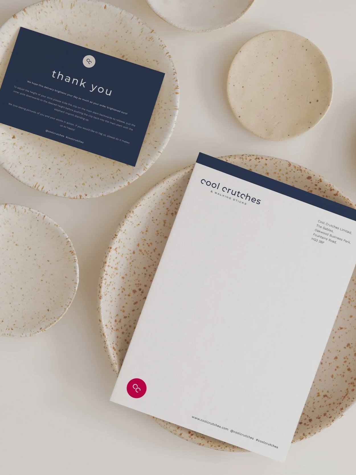
5. Consistency as the Real Signal
Of all the signals, this is the one that most founder-led brands miss. A customer builds trust cumulatively. Every touchpoint -the email they receive after purchase, the packaging they open, the website they return to, the social grid they scroll - is contributing to or eroding their sense of your brand's quality.
One inconsistent touchpoint in a sequence of premium ones creates doubt. And doubt, in a consumer buying decision, is enough to push them to a competitor who feels more reliable.
Premium brand design is not an aesthetic choice. It's a commercial infrastructure decision. Every signal described above is reviewable, improvable, and testable. If you want to understand how your brand is performing across these dimensions and identify the specific signals that are costing you trust and conversion a Brand Authority Audit is the place to start.