S.Gabrielle
Brand Identity Design for a Statement Fine Jewellery Brand
S.Gabrielle is a fine jewellery brand founded by Sophia, creating bold, expressive pieces designed to bring a sense of joy to luxury jewellery.
Ahead of launching the brand, Sophia approached Soley Creative to create a distinctive fine jewellery brand identity that could establish S.Gabrielle within the luxury market without relying on the restrained visual conventions often associated with the category.
Our discovery process uncovered a much richer source of inspiration.
Sophia's nostalgia for growing up in Brooklyn, her family and friends, flowers, art and architecture all became part of the visual world. An existing wave ring design proved particularly significant: its unusual, maximal form captured the expressive character of the jewellery and became a thread running through the wider identity.
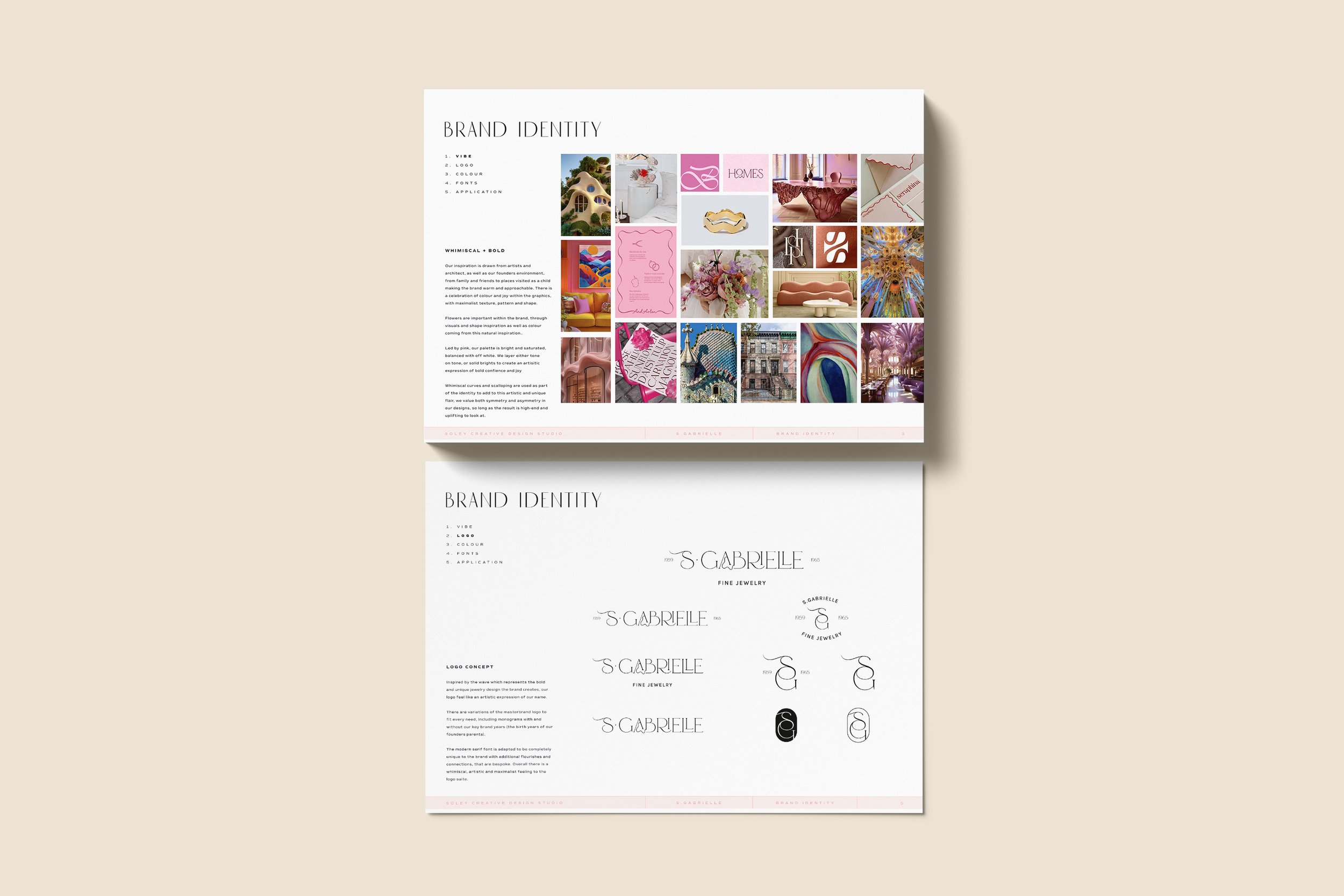
From jewellery design to recognisable brand asset
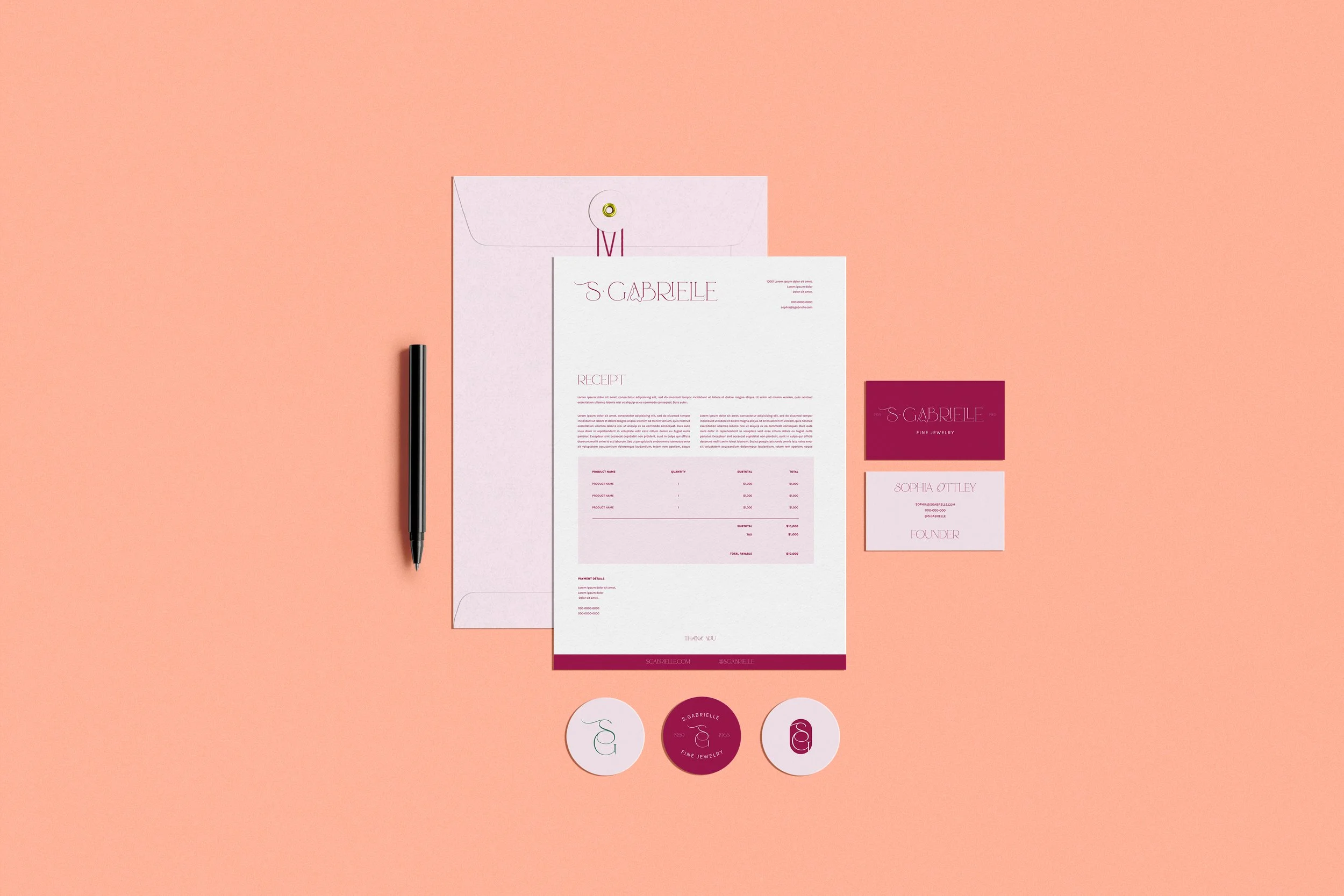
We translated the wave into a bespoke logo suite, adapting an elegant modern serif with distinctive curves, flourishes and connections. Variations of the identity also incorporate the birth years of Sophia's parents, adding a subtle and personal connection to the family story behind the brand.
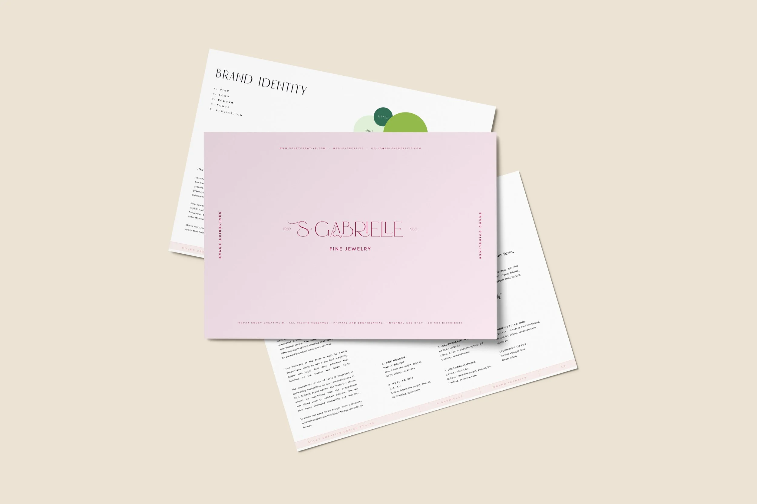
Rather than defaulting to traditional neutral luxury codes, we created a saturated, pink-led colour palette supported by joyful greens, yellow, melon, lilac and blue. Whimsical curves, scalloping, floral references and expressive typography add further character, creating a brand that feels luxurious and considered while retaining S.Gabrielle's bold personality.
The result is a luxury jewellery brand identity that reflects the statement nature of the product: high-end, artistic and confident, with the colour and optimism of dopamine dressing.
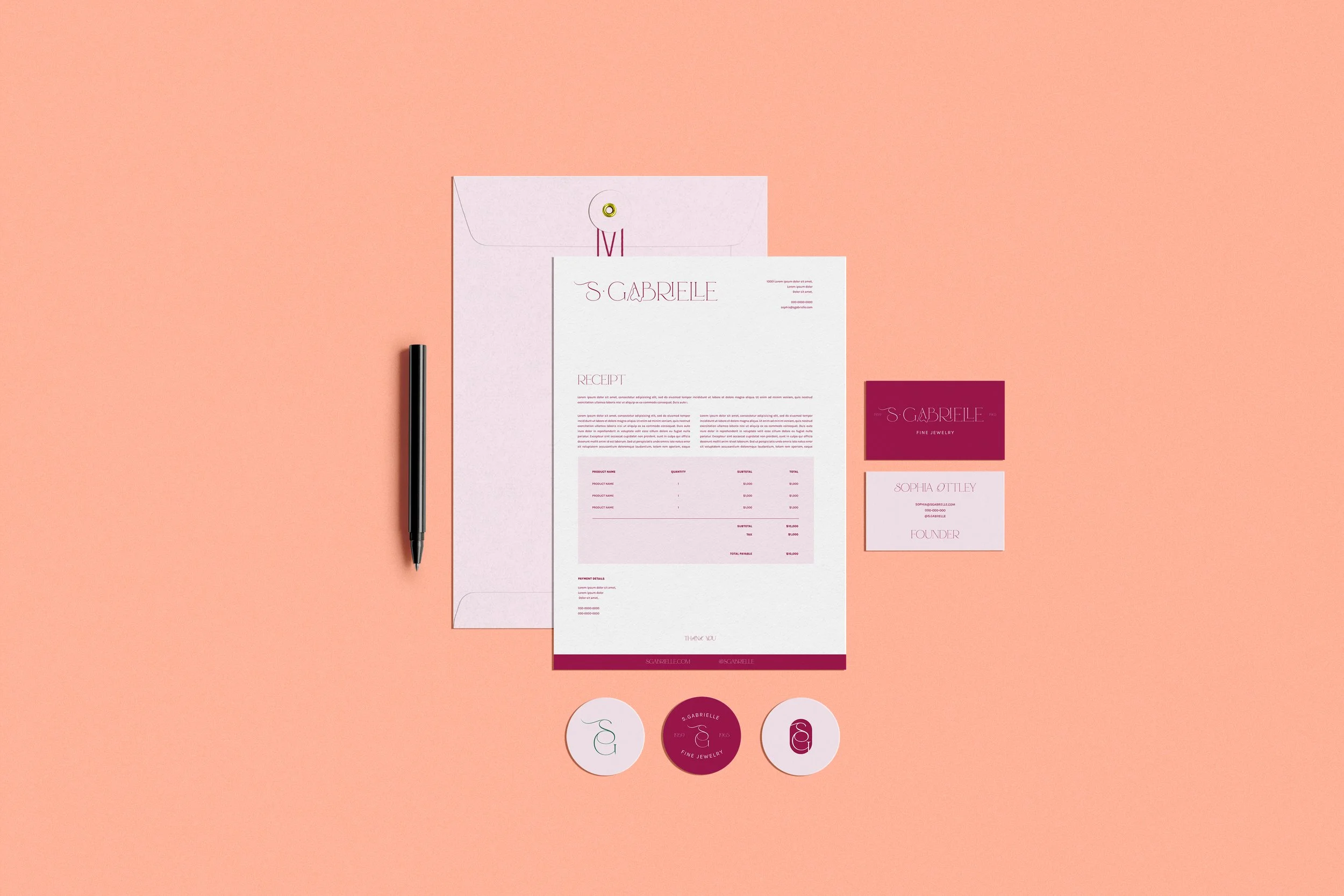
Stationery concept application
Creating a foundation for launch
Alongside the visual identity, Soley Creative developed comprehensive brand guidelines for the jewellery brand, defining the logo suite, colour hierarchy, typography and examples of how the identity could translate across packaging, stationery and future customer touchpoints.
This gave Sophia a clear visual system to take S.Gabrielle to market. Following handover, the brand used these foundations to create a cohesive ecommerce website and launch its first jewellery collection independently in-house.
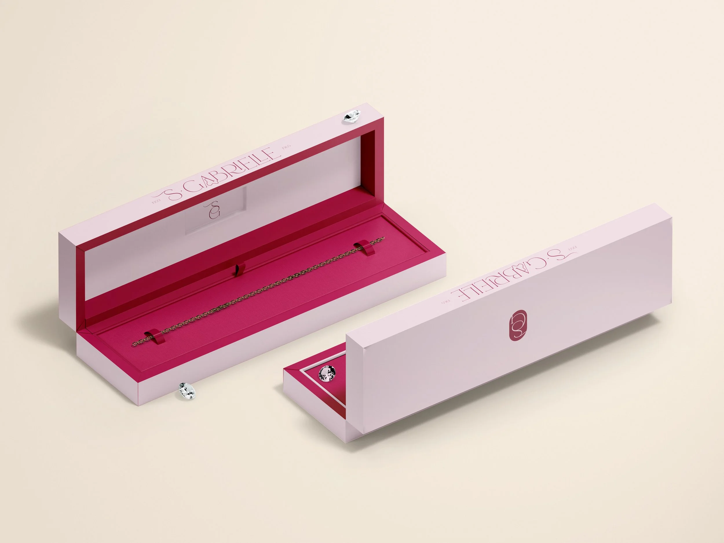
Jewellery Box Concept
“It’s incredible what you’ve been able to capture in such a short period of time. Highlighting the wave concept with the jewelry pieces, pink at the heart of the themes, the modern/Copenhagen feel, flowers, art, and the family/friends concept.”
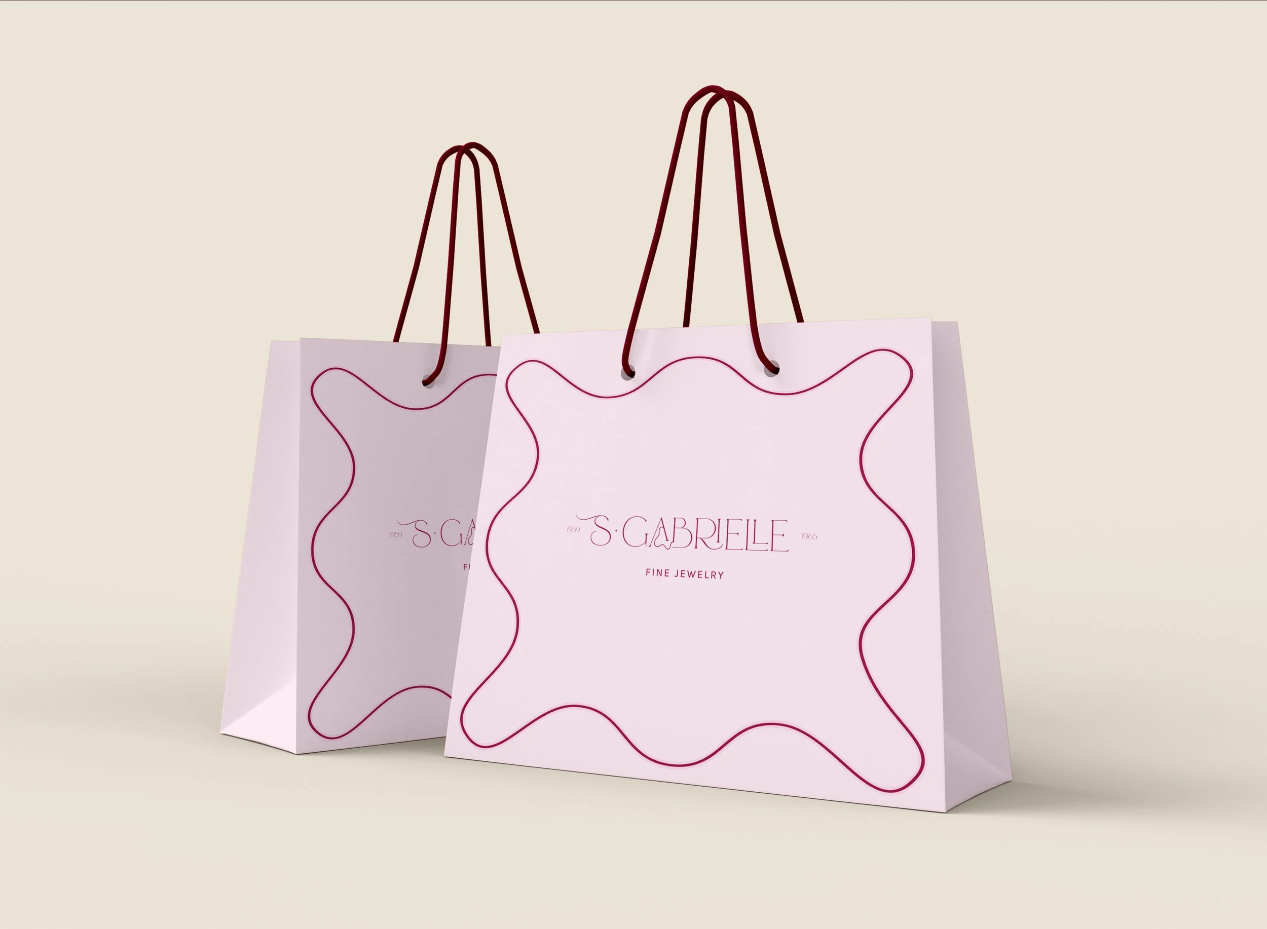
Bag Concept
A strong identity shouldn't simply make a new business look established. It should give customers something distinctive to recognise, remember and return to, building the foundations for long-term brand equity.
MORE PROJECTS TO LOVE