Purple: The Colour of Luxury, Creativity and Quiet Power in Branding
Purple is unlike any other colour on the branding spectrum. It straddles the line between royalty and rebellion, elegance and emotion. And when used correctly, it’s unforgettable.
Got a project in mind and want to get in touch?
The Meaning:
In the West, purple has long been linked with royalty and wealth, due to its rarity and cost to produce. It was once reserved for emperors, queens and clergy. Today, it retains its prestige while also gaining relevance in the world of creativity, spirituality and wellness.
In many Eastern cultures, purple represents nobility, spiritual depth, and even good fortune. Its duality makes it especially interesting for brands wanting to feel both established and emotionally rich.
Psychological Impact:
Luxury & Elegance: Deeper purples (like plum or aubergine) feel regal and exclusive.
Creativity & Expression: Brighter purples bring in fun, originality and uniqueness.
Calm & Wellness: Lavender and lilac variations can ease tension and communicate care.
Whether you’re launching a high-end product, building a coaching brand, or reimagining your fashion label purple makes a statement.
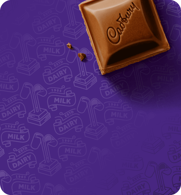
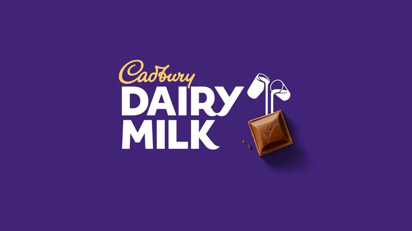
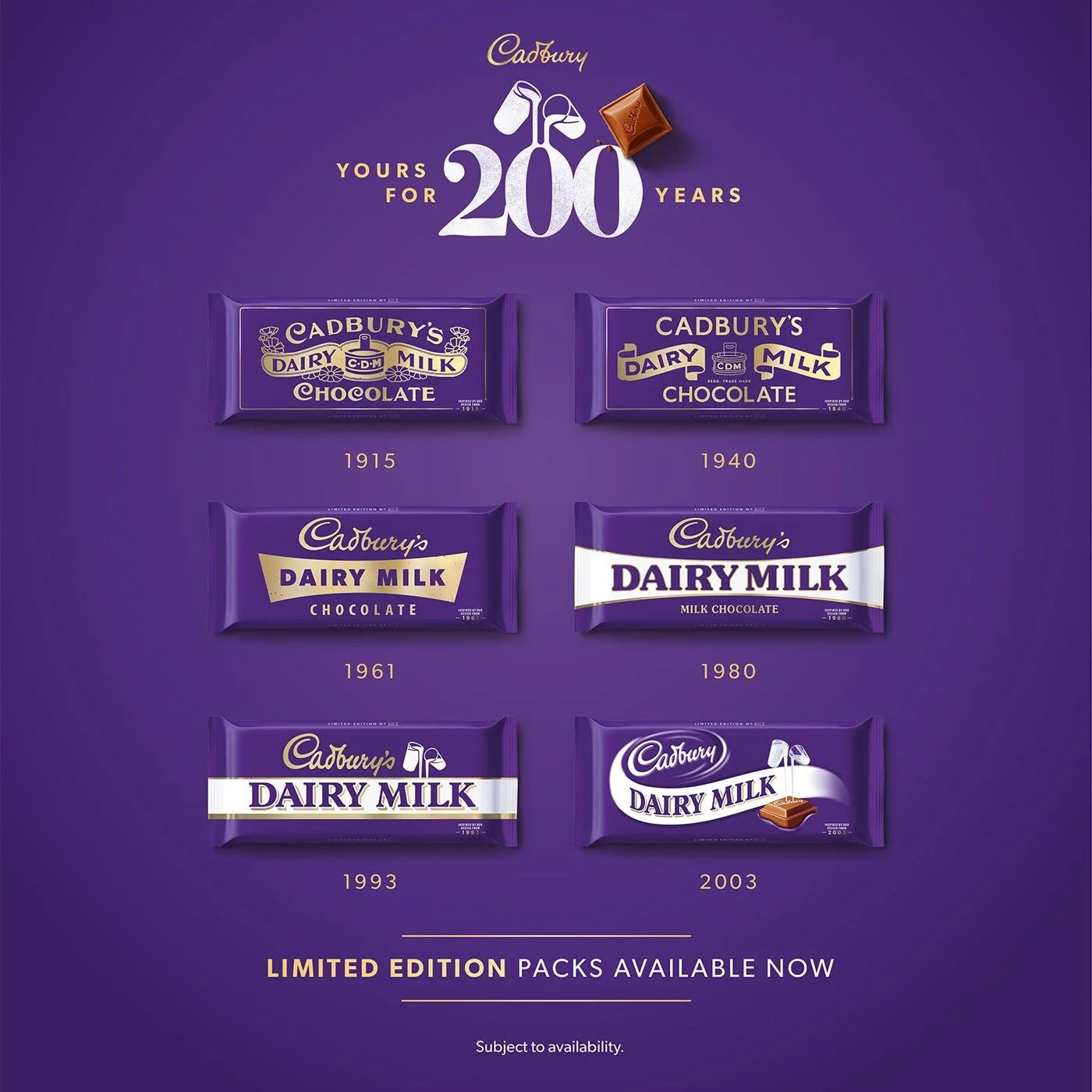
Brand Case Study: Cadburys
Cadbury’s iconic purple (Pantone 2685C, if you're curious) is used across its packaging and advertising to build a sense of indulgence, heritage, and trust. It's a masterclass in owning a colour and aligning it perfectly with a feeling: “treat yourself.”
Palette Psychology:
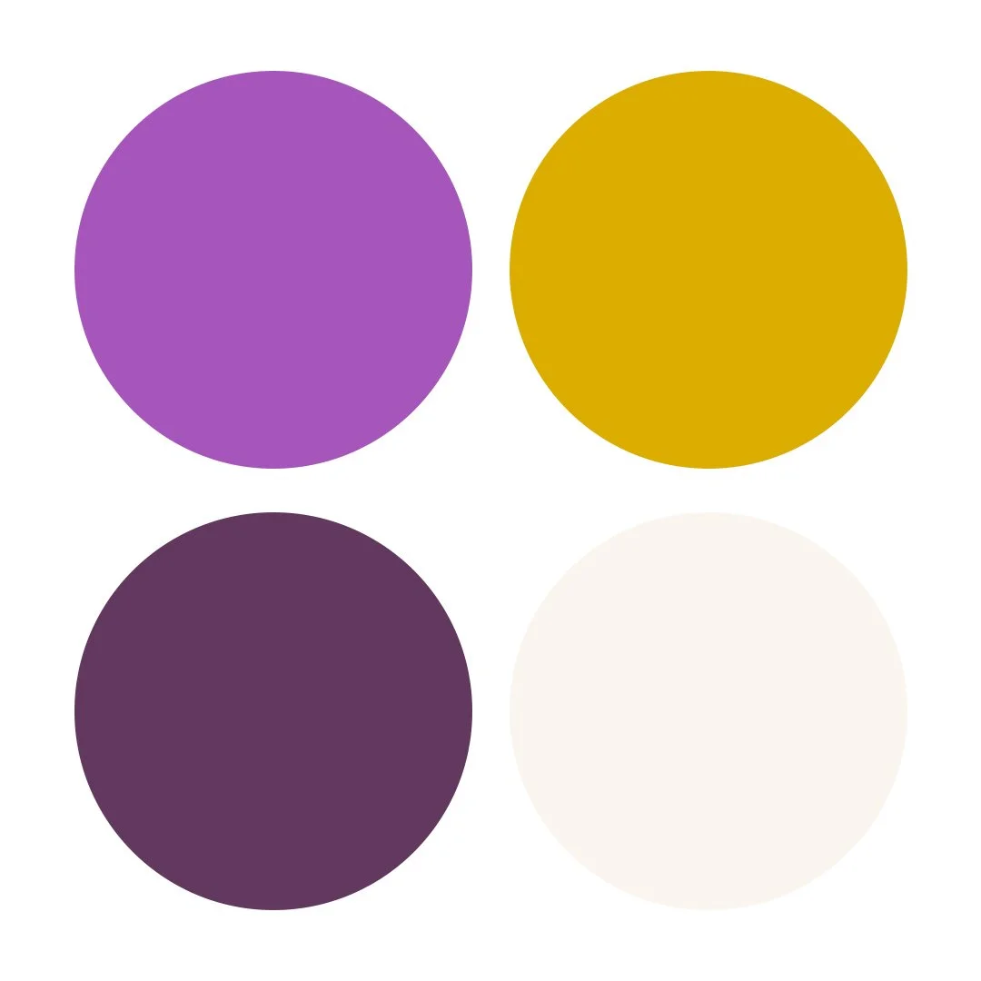
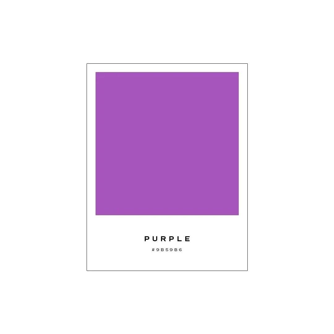
Palette 1:
Regal Riches
Purple (#9B59B6), Gold (#D4AF37), Deep Plum (#5C3A5D), Porcelain (#F9F5F0)
Creates instant luxury and heritage appeal.
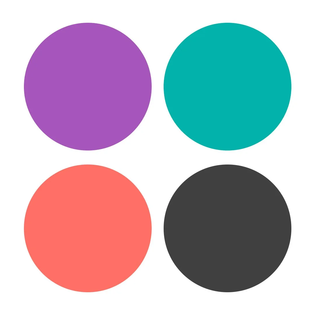
Palette 2:
Bold Creative
Purple (#9B59B6), Teal (#3AAFA9), Coral (#F9796C), Charcoal (#404040)
Expressive and energetic for brands with personality.
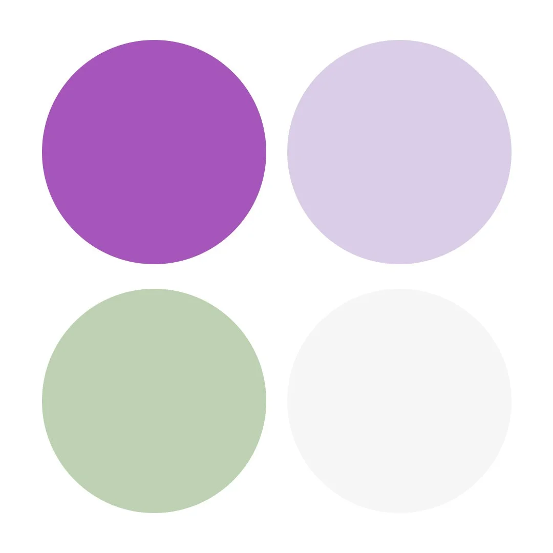
Palette 3:
Calm & Spiritual
Purple (#9B59B6), Lavender Mist (#D8CDE6), Sage Green (#C1D0B5), Off-White (#F6F6F6)
Emotionally balanced and soft for wellness or slow living brands.
The Soley Creative Process: Using Black Strategically
At Soley Creative, we design brands that don’t just look beautiful, they sell beautifully. Colour is one of the most commercially valuable tools we have, and we use it to:
✔ Attract the right audience
✔ Build brand recognition
✔ Increase click-throughs and conversions
✔ Create a sense of emotional resonance that makes people care
We combine colour psychology, consumer behaviour and years of retail experience to craft brand identities that are both strategic and stylish.
📌 If purple feels right for your brand or you want help choosing colours that align with your brand story head to our client application form.