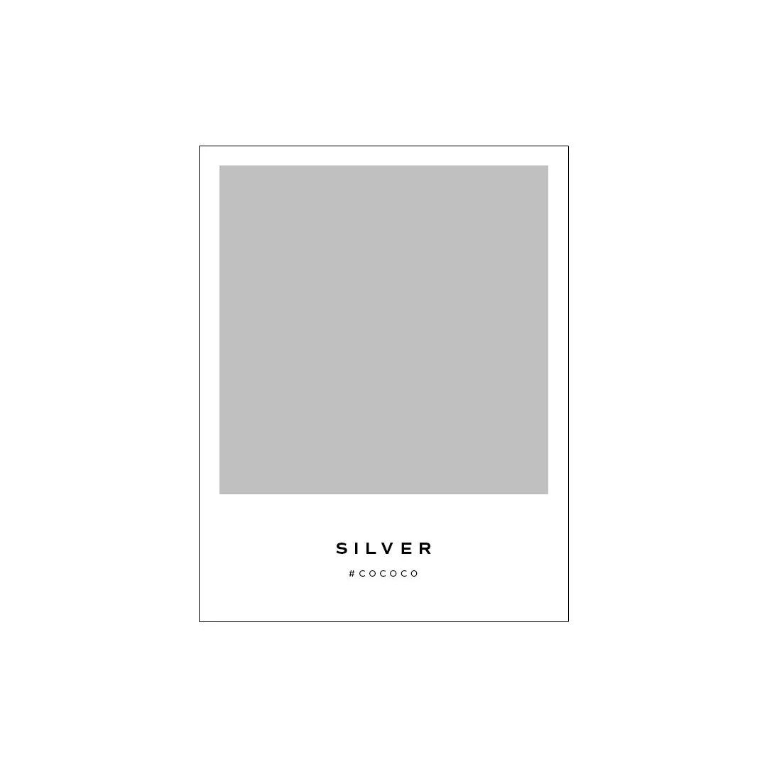
Silver: The Colour of Cool Confidence and Modern Elegance in Branding
As we wrap the year in reflective mode, it’s only fitting to spotlight a colour that embodies clarity, grace, and futuristic thinking - Silver.
Unlike louder colours, silver brings emotional space into your branding. It’s not trying to be trendy, but it’s quietly confident. And in a crowded market, that makes it unforgettable.
Got a project in mind and want to get in touch?
The Meaning:
In Western culture, silver is seen as cool, sleek, and refined - often associated with tech innovation, modernism and prestige. In Eastern culture, silver is associated with purity, prosperity, and ceremony.
Across the globe, silver captures attention without demanding it. It’s versatile, neutral, and subtly luxurious.
Psychological Impact:
Emotionally Cooling: Silver calms the viewer and allows space for clarity.
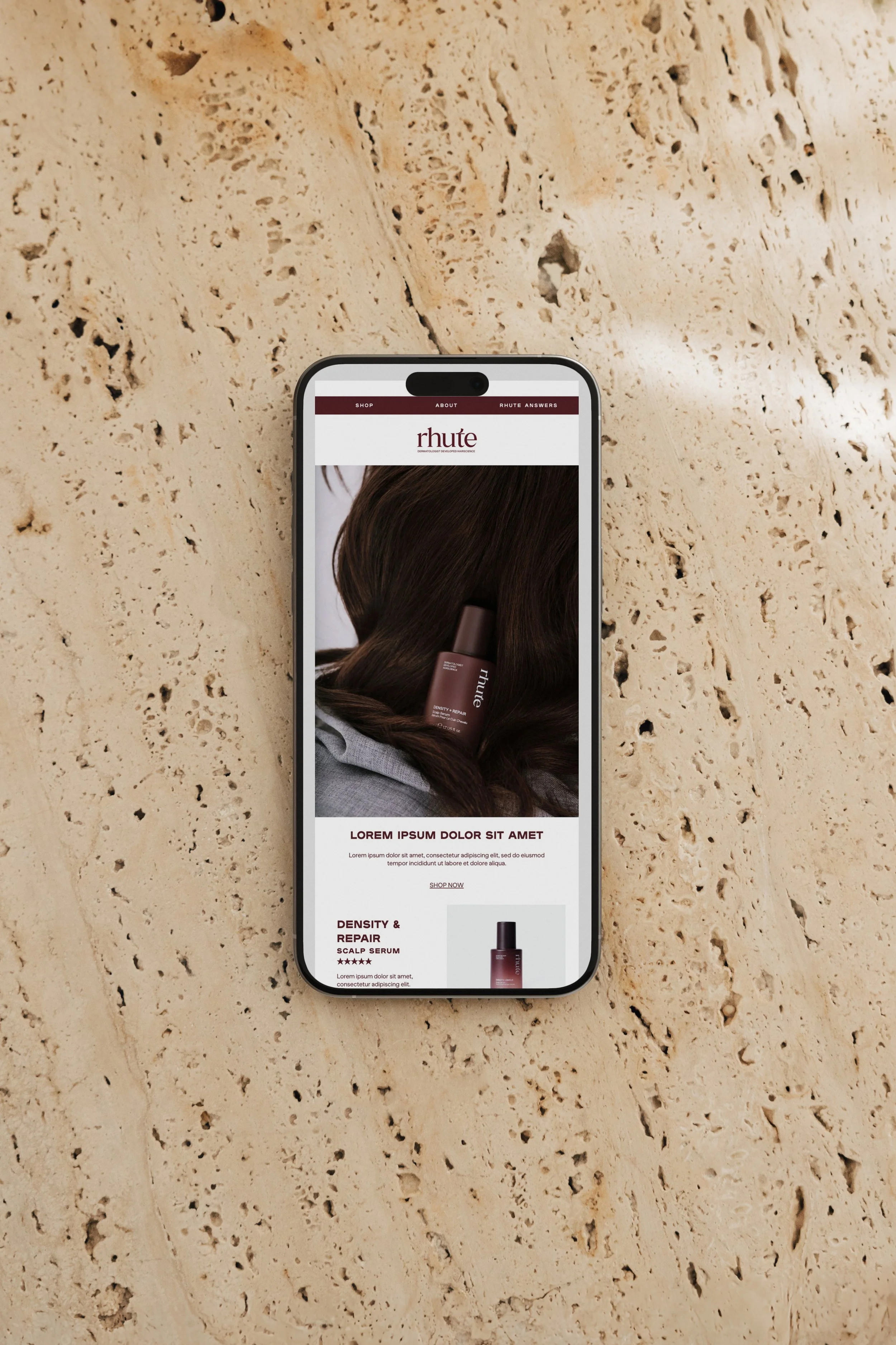
Neutral + Premium: It’s often used by brands who want a modern, elevated, yet unpretentious feel.
Flexible & Future-Focused: Silver works across sectors, tech, fashion, beauty, interiors, because of its timeless neutrality.
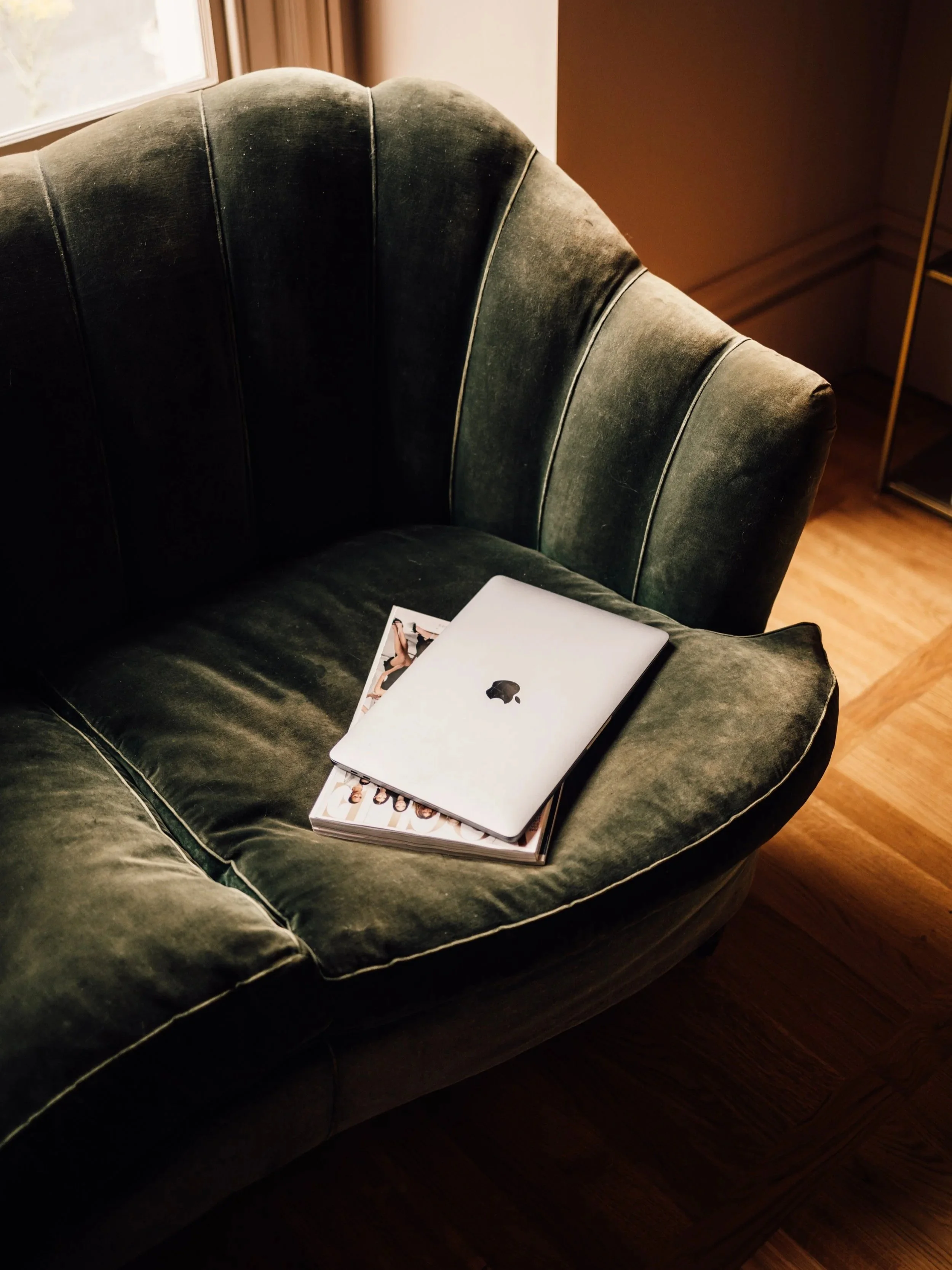
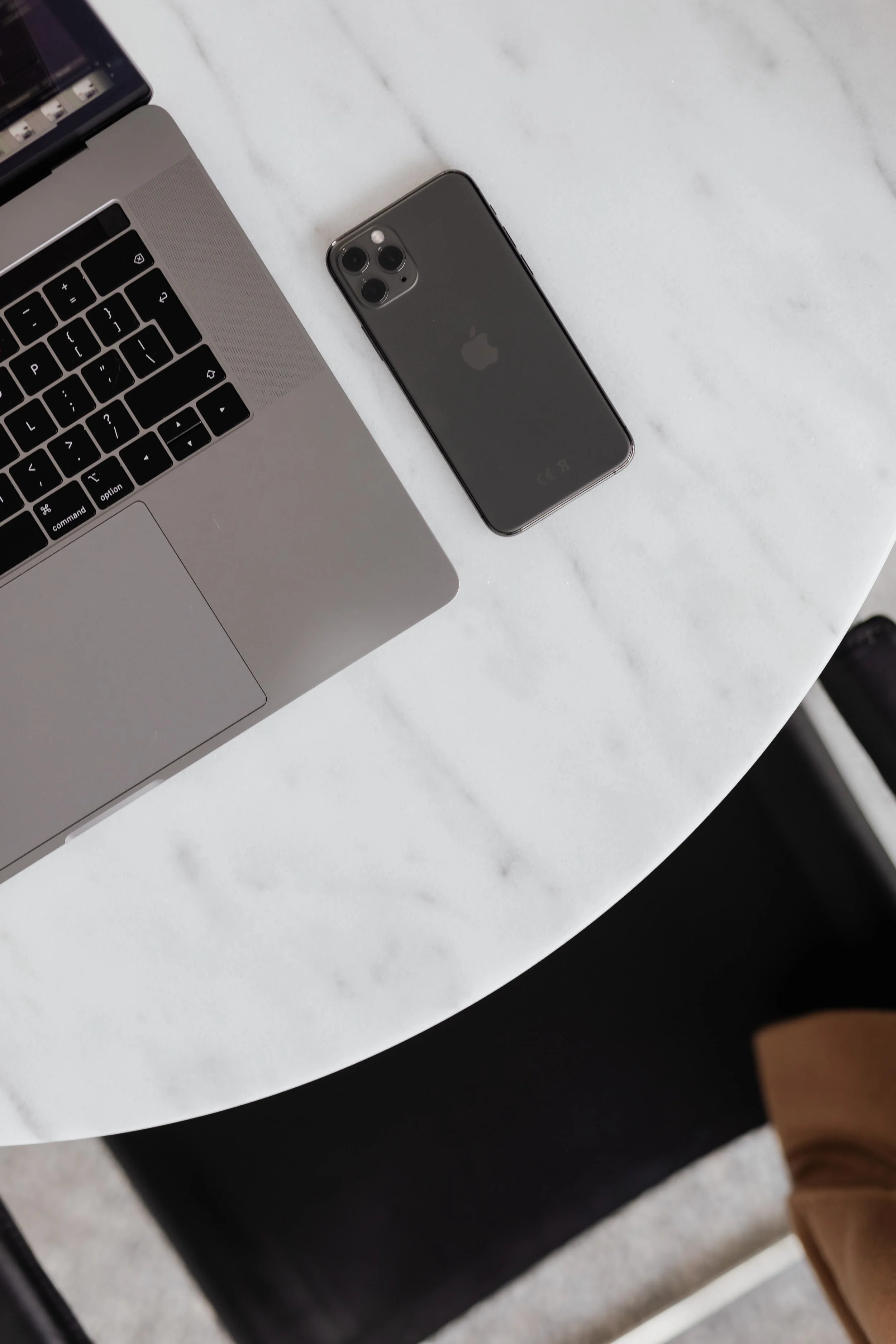
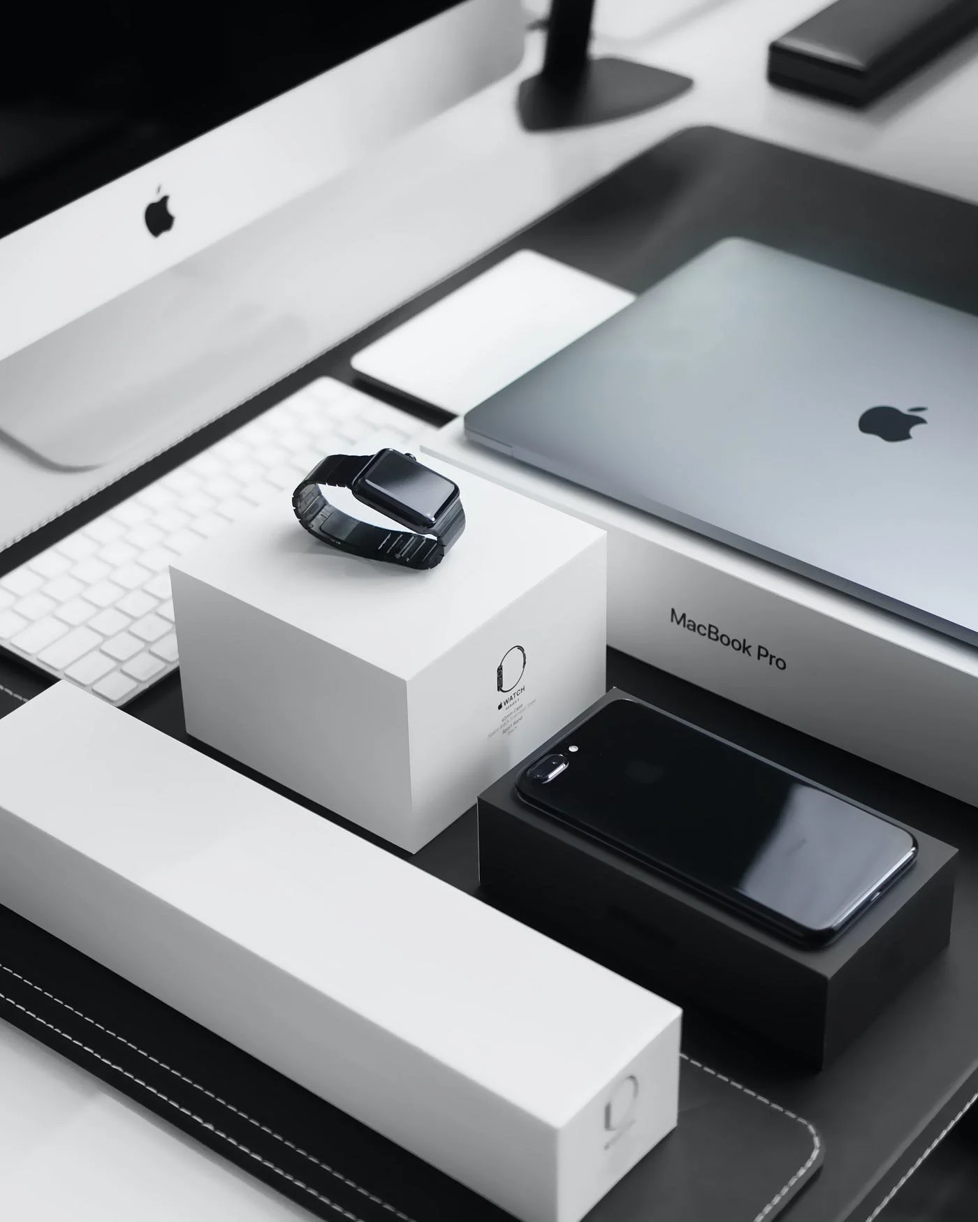
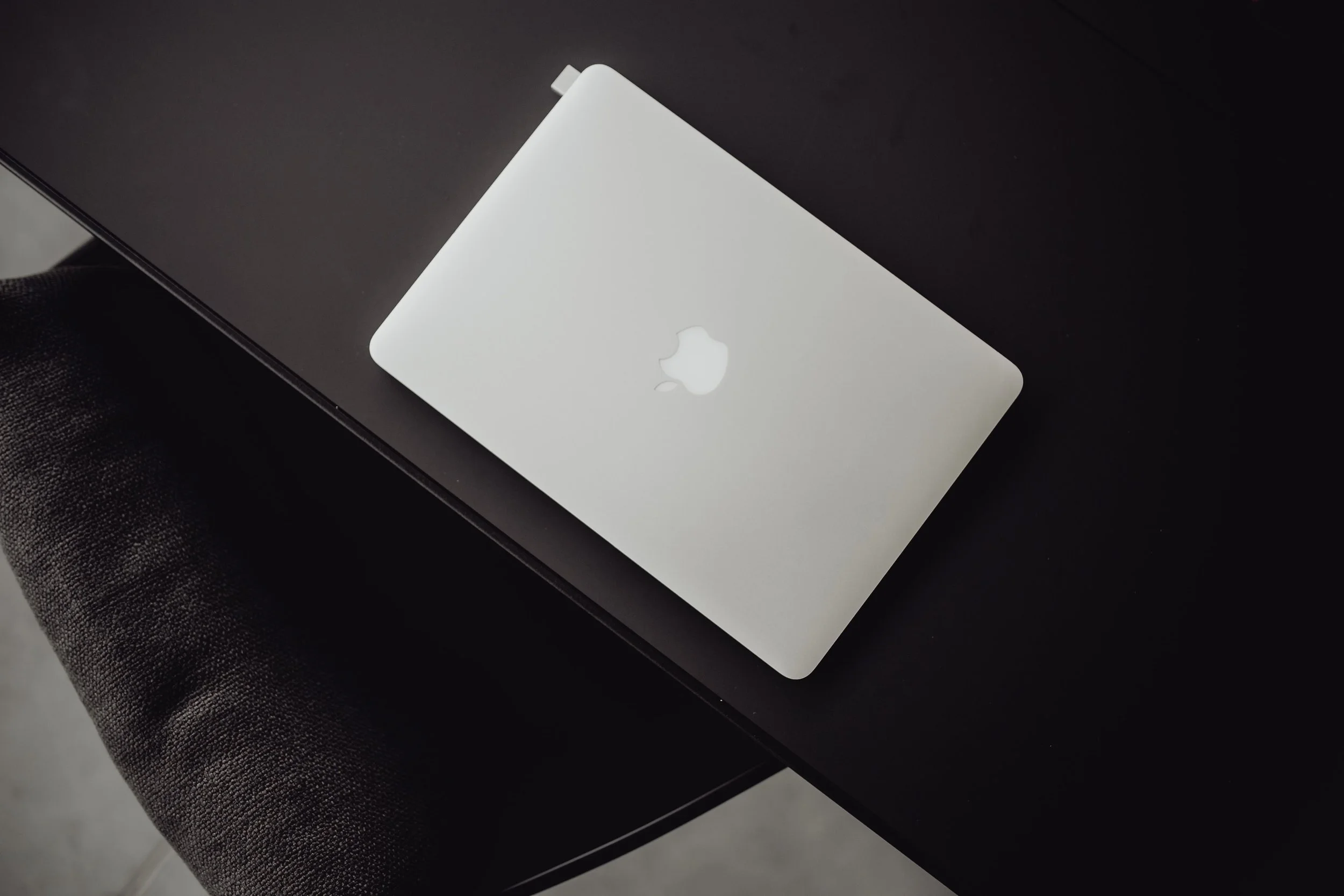
Brand Case Study: Apple
Apple’s silver product finishes are an excellent example of colour psychology at work. They suggest innovation with calm confidence, offering a softer, more approachable alternative to stark black or flashy gold.
In Apple’s world, silver = trust, sophistication, and effortless user experience.
Palette Psychology:
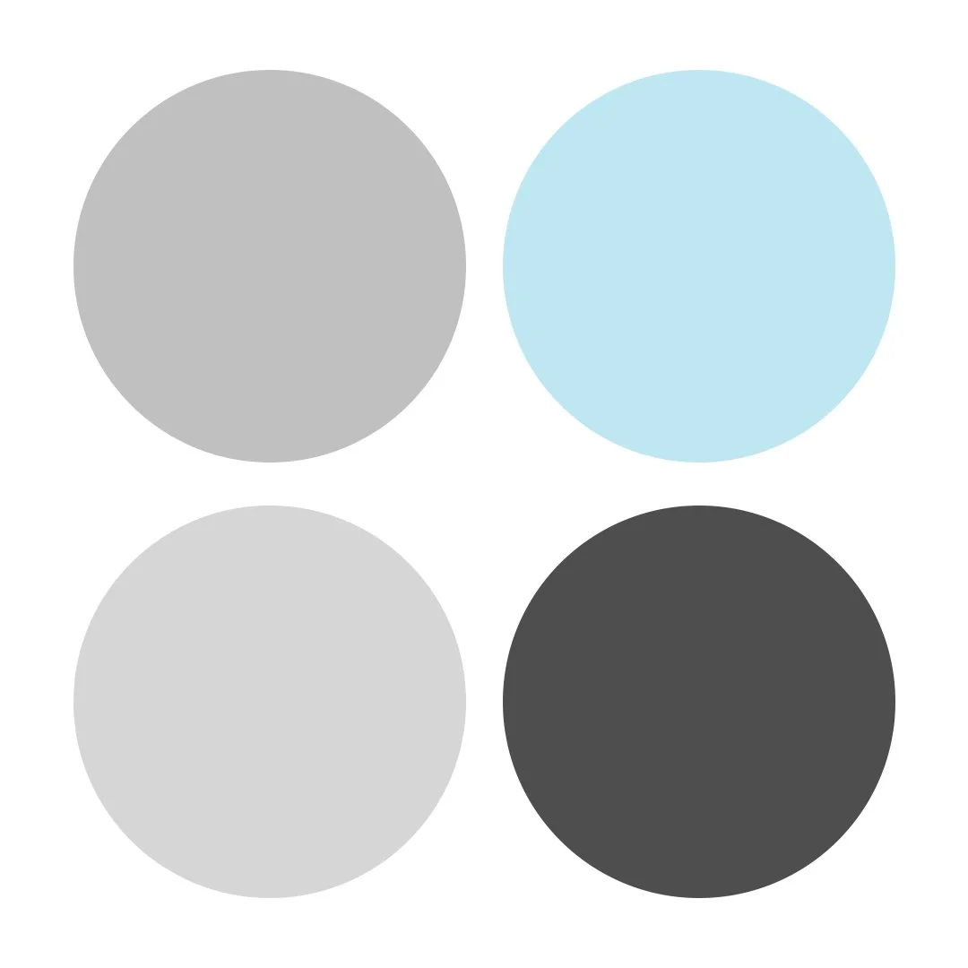
Palette 1:
Frosted Luxe
Silver (#C0C0C0), Ice Blue (#C6E6F1), Dove Grey (#D6D6D6), Soft Charcoal (#4E4E4E)
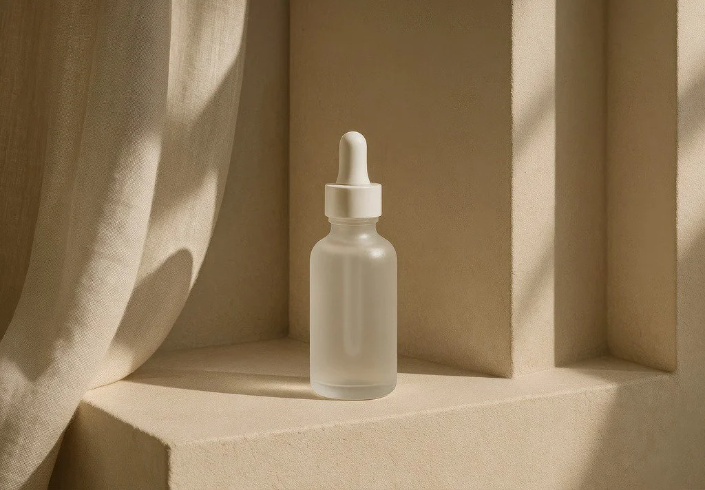
Feels elevated and clean - ideal for December campaigns, skincare, or premium packaging.
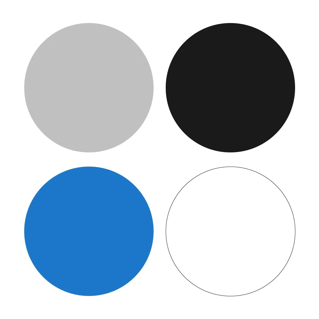
Palette 2:
Modern Tech
Silver (#C0C0C0), Jet Black (#1A1A1A), Electric Blue (#3A75C4), Pure White (#FFFFFF)
Conveys innovation, minimalism and trust. A perfect base for tech start-ups or data-driven services.
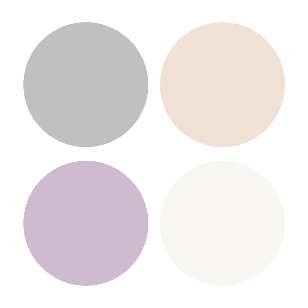
Palette 3:
Quiet Luxury
Silver (#C0C0C0), Champagne Beige (#EFE1D6), Dusty Mauve (#CBBACD), Soft White (#F7F6F3)
Speaks softly but communicates high value. Perfect for brands that prize understated quality.
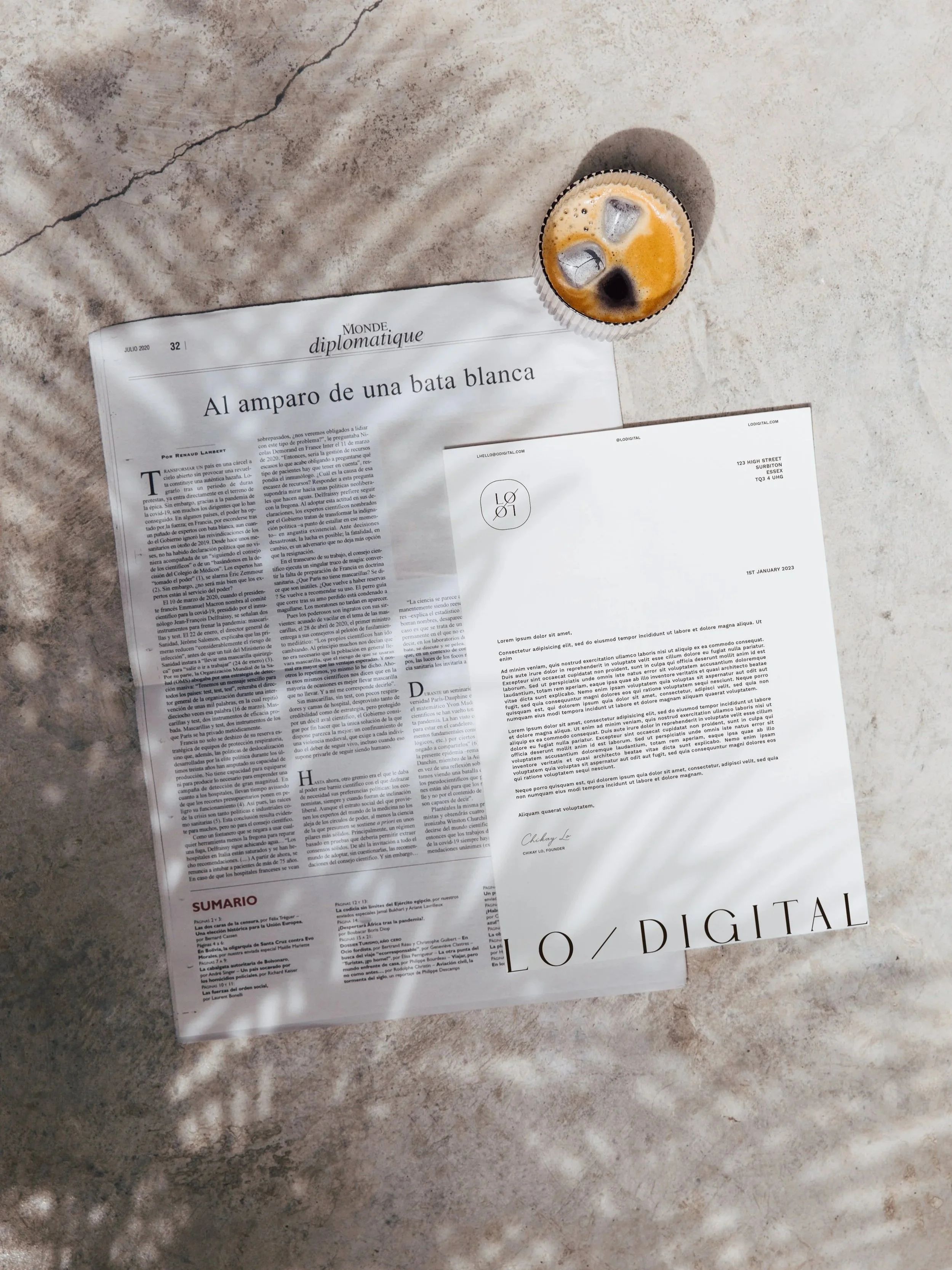
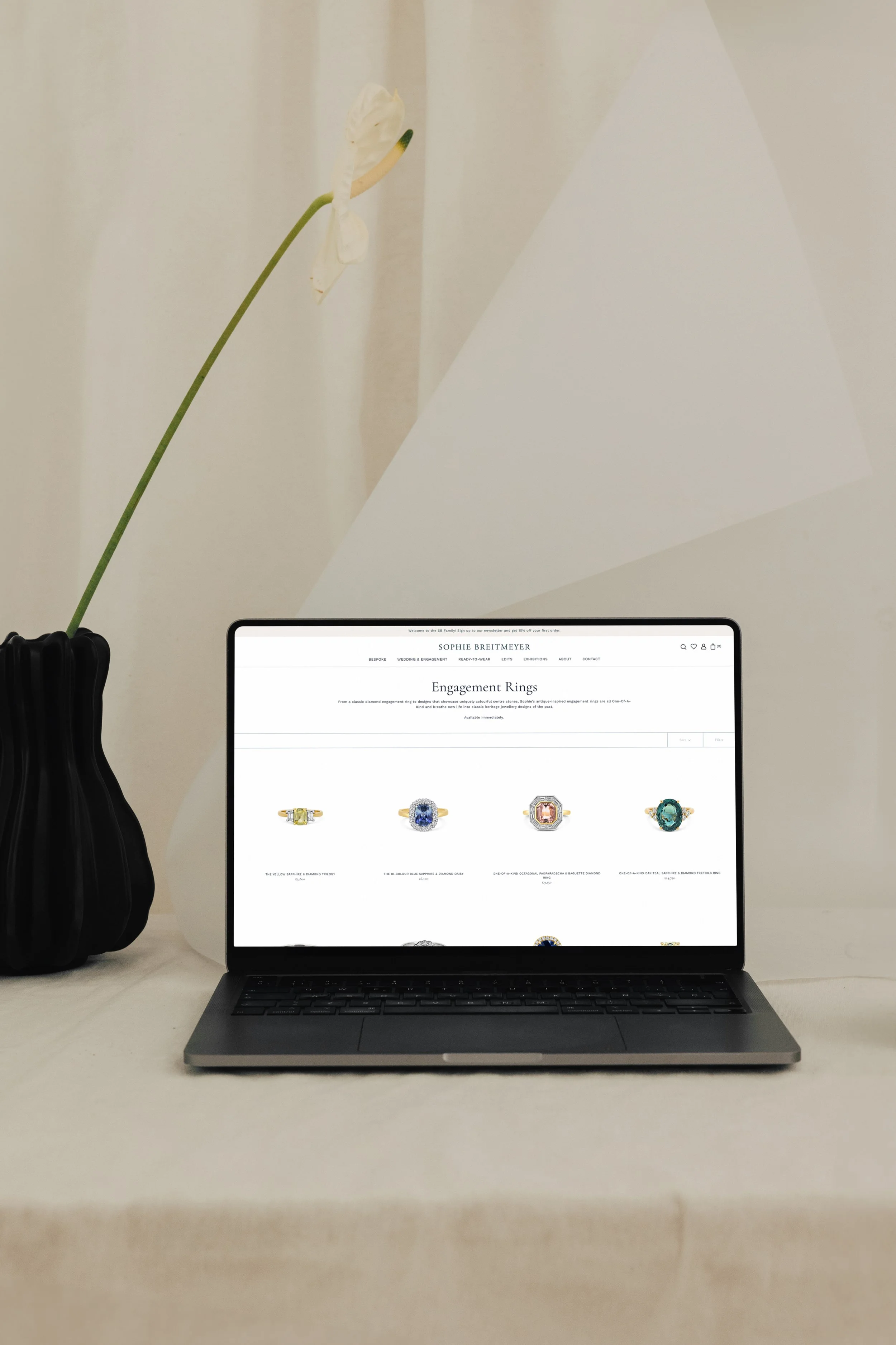
The Soley Creative Colour Process
At Soley Creative, we don’t pick colours to be pretty, we choose them to be powerful. Every hue we use in your brand identity is backed by psychology, positioning, and real-world results.
Silver works best when your brand values:
✔ Innovation
✔ Clarity
✔ Calm Confidence
✔ Elevated Everyday Experiences
📌 Ready to build a visual identity that supports premium pricing, repeat purchases, and long-term customer love? Let’s chat.