Designing a Visual Identity That Feels Like You
You’ve got a great product. Your customers love you. You’ve even got a logo and some colours in a Canva folder. But when it comes to your brand identity…something’s not clicking.
It looks nice. But it doesn’t feel quite right.
Like putting on a dress that fits, but isn’t really your vibe.
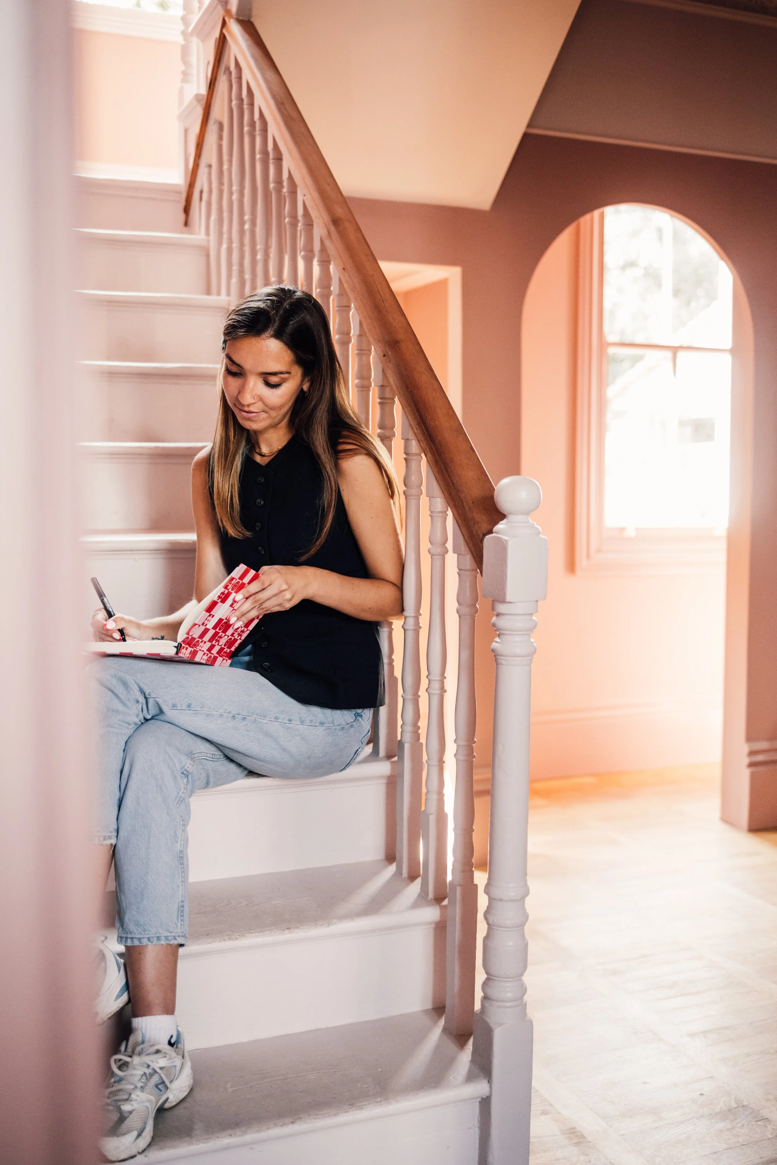
Guess what? Your visual identity isn’t just about “looking professional.” It’s about expressing who you are (especially as a solo founder) and what your business stands for. When it’s aligned with your personality, values, and customer vibe, it doesn’t just look better – it works harder.
Let’s get into how to make that happen.
Got a project in mind and want to get in touch?

1. Start with Personality, Not Just Aesthetic
Before you start picking colours or fonts, ask yourself:
What’s the personality of my brand?
Not your job title. Not your ideal customer. You.
Are you polished and elegant? Playful and cheeky? Quietly confident? Loud and rebellious?
You don’t need to be everything to everyone. You just need to be unmistakably you.
Try these prompts:
- If my brand were a person, how would they speak?
- What 3 words describe how I want my brand to make people feel?
- What do I not want my brand to feel like?
This personality becomes the filter for every design decision.
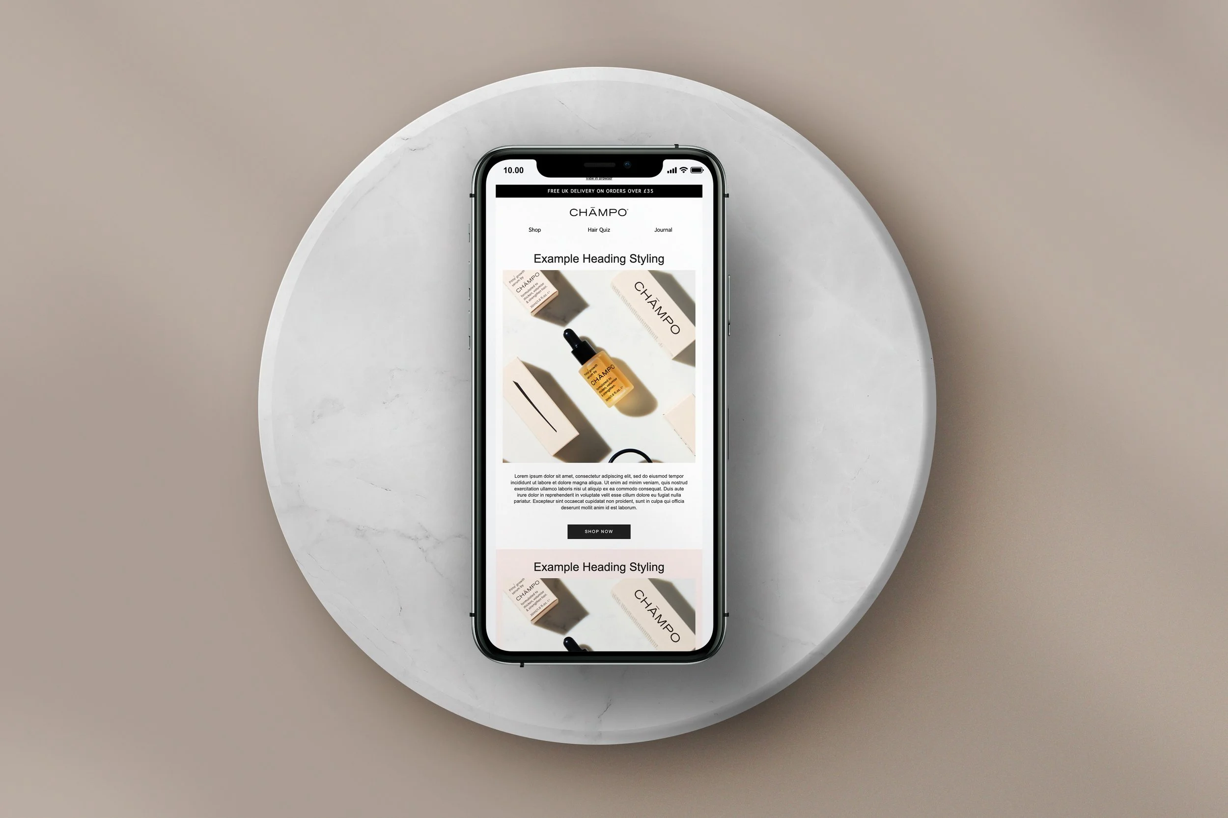
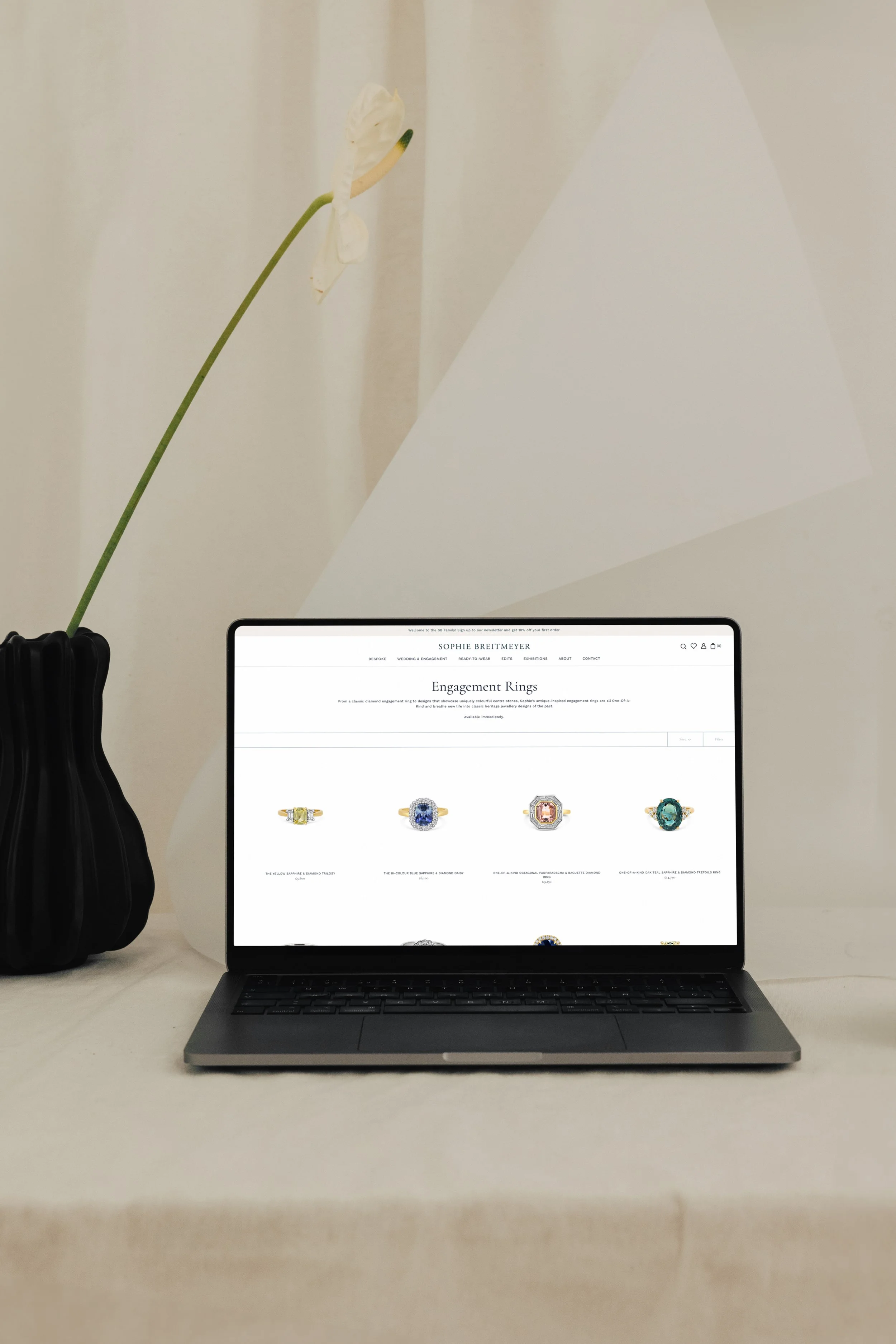
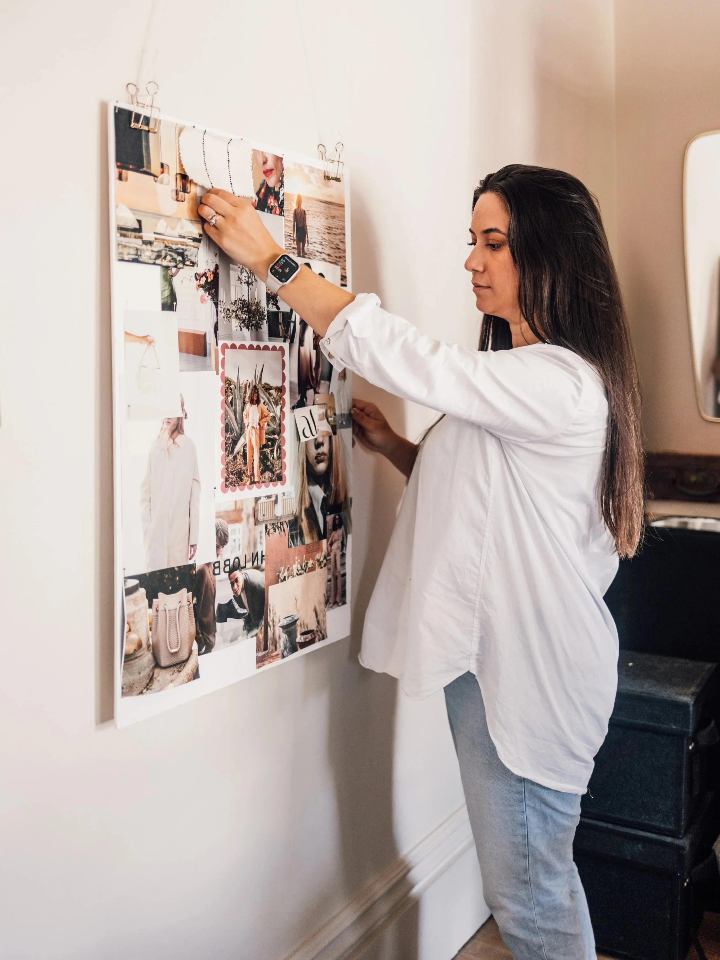
2. Choose Visuals That Reflect (Not Just Impress)
It’s tempting to pick whatever’s trending – beige neutrals, 70s serifs, pink-on-pink palettes – but trends fade. Authenticity sticks.
Once you’ve nailed your personality, use it to guide your design.
Fonts:
- Elegant serif = premium, classic
- Bold sans serif = modern, confident
- Handwritten = personal, informal
Colours (check out or posts on consumer psychology and colour for more on this!)
- Warm tones feel grounded and welcoming
- Cool tones feel fresh and calming
- Neons? Loud, attention-grabbing, fun
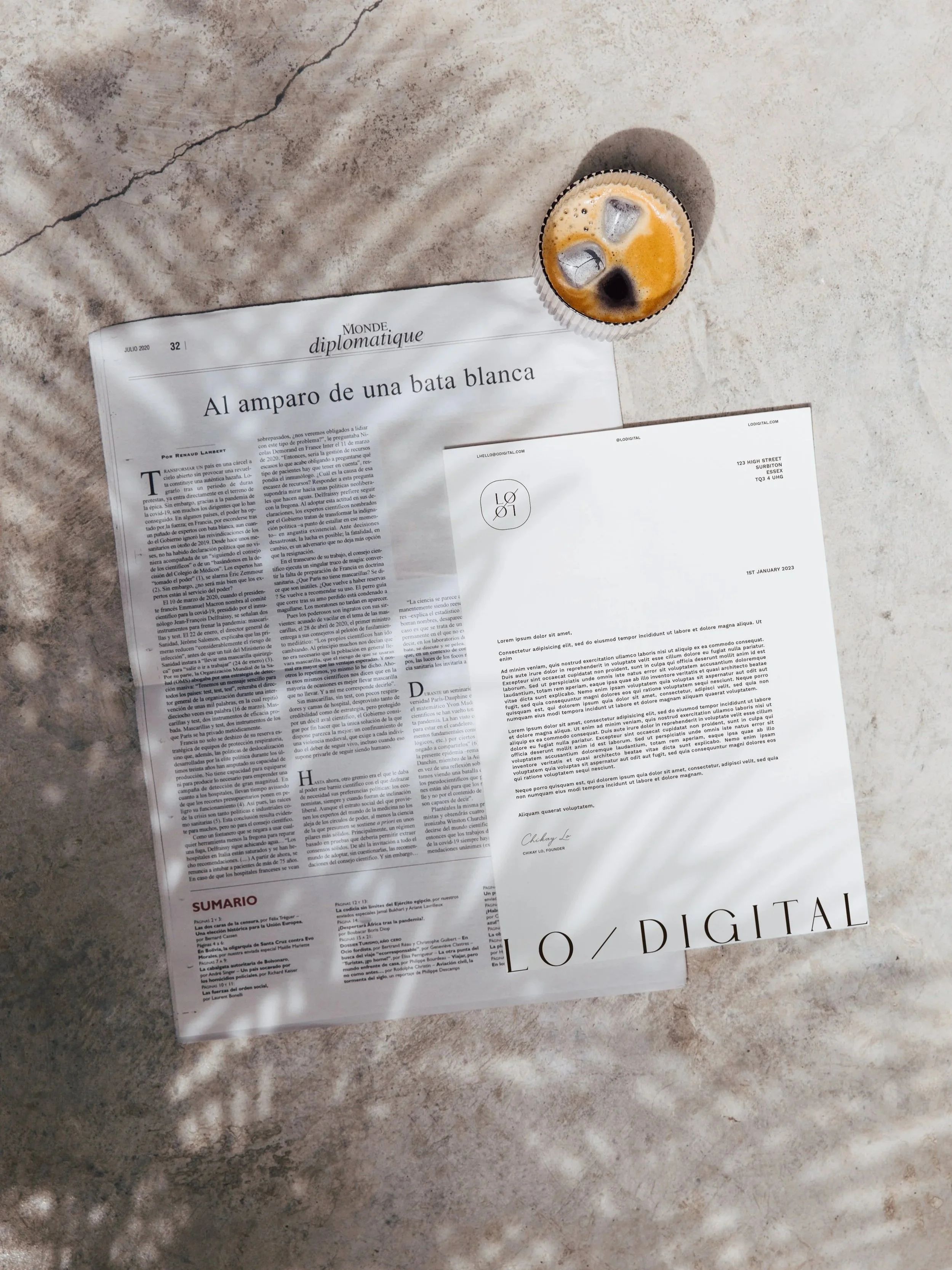
Imagery:
- Use photos that reflect your values and tone – natural vs. styled, human vs. object-focused, muted vs. vibrant
Pro tip: Design is emotional. Choose elements that evoke the feeling you want customers to associate with your brand.

3. Ditch the Design-by-Committee Energy
This is where a lot of founders get stuck. They ask five friends what they think of their logo. They try to please their mum, their assistant, and their ex-agency contact…And guess what? The brand ends up watered down, forgettable, and nothing like you.
Here’s your permission to make your own aligned choices. You don’t need to justify your style if it’s true to your purpose and your customers.
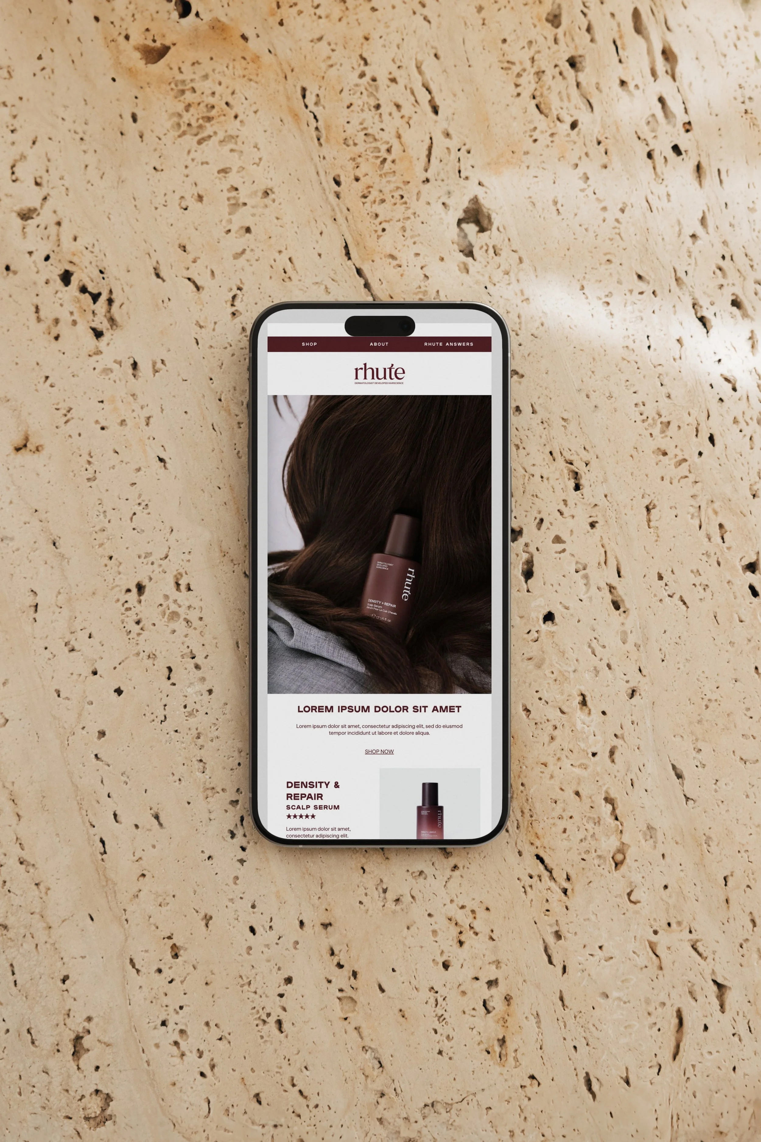
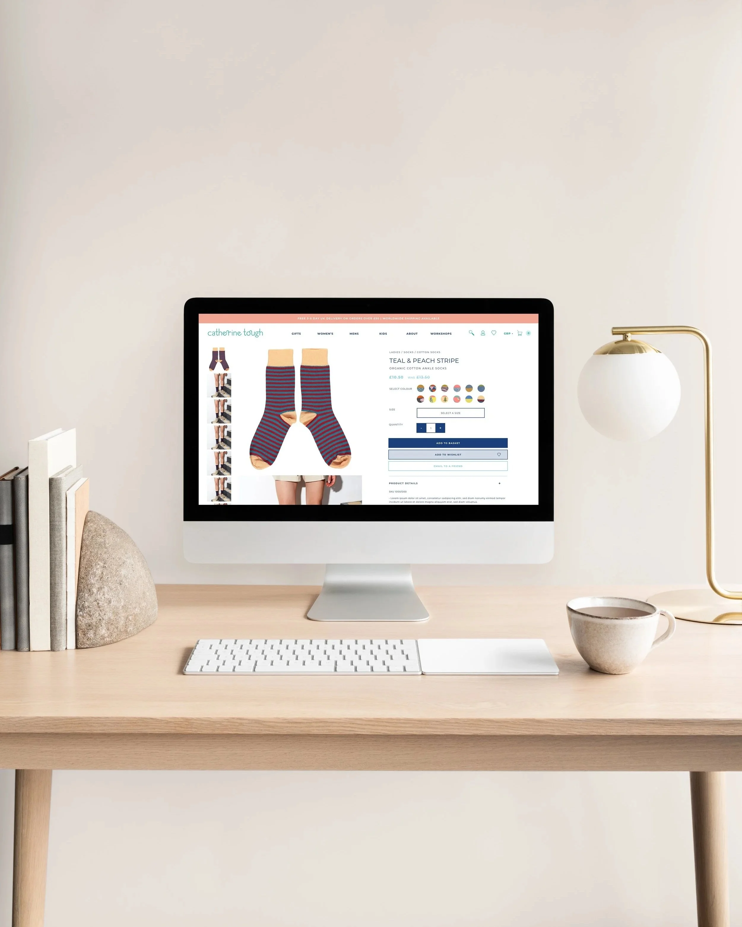
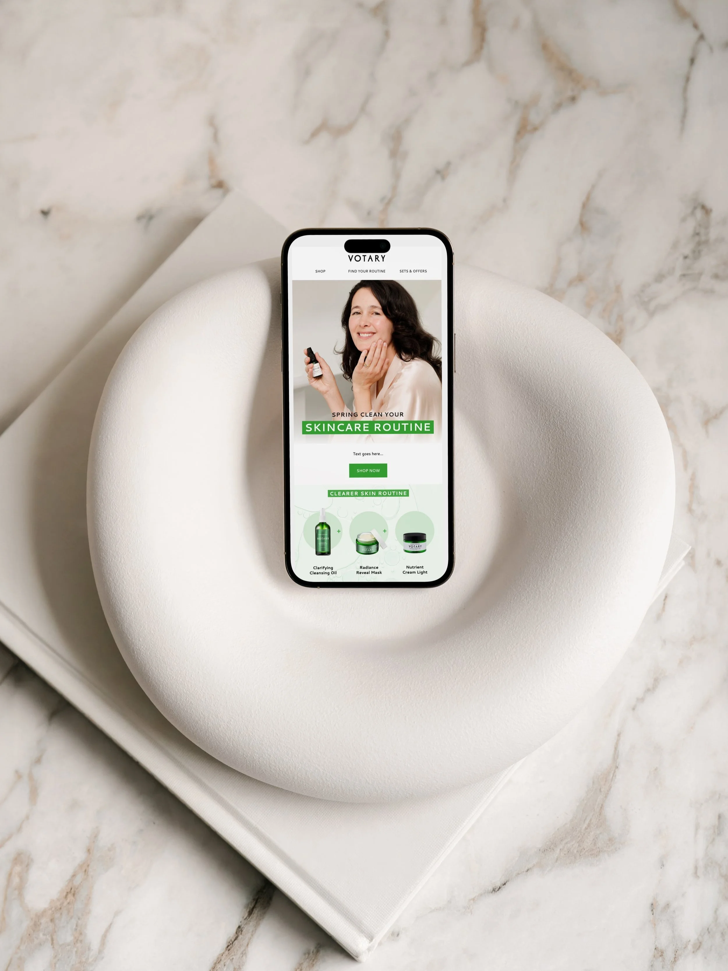
4. Bring It to Life with Consistency
Once you’ve defined your look, make it work for you:
- Use templates that reinforce your identity across platforms
- Reuse your brand elements in fresh, creative ways
- Keep tone of voice and visuals aligned in every post, email, and page
Consistency builds recognition. Recognition builds trust. Trust builds sales.
You are your brand’s superpower. Design like it.
Your visual identity should feel like a natural extension of you, not a costume. When your brand feels aligned, people feel that. They connect. They remember. And they buy.
So if your current identity feels off-brand, off-vibe, or just plain off – let’s change that.
👉 Apply for a call and let’s build a visual identity that’s magnetic, memorable, and so you.